Bit of a two-for for this ATC creation, mostly because the first one didn’t quite turn out as expected.
To be fair, neither did the second but then this creative journey is about trying different things and experimenting :)
So, here’s the first one.

A beautiful sentiment I thought. I wanted the ATC to reflect the words of the sentiment.
I therefore started out by coating the cardstock in a variety of Versacolor pigment inks, smearing and spreading them across the page.
After inking up the stamp (from the Friendly Advice set by Inkadinkado) with Versafine ink I chose what I thought would be a good place to plop the sentiment onto, and pressed.
Next I trimmed around the sentiment with my Tonic guillotine.
Not bad so far but I thought that it need a little something else.

Given that the sentiment was by a child I thought that it might be a fun design element to include a couple of finger prints, to make it look as though it was more of a finger painting than a refined piece of art.
To finish I used a gold metallic marker to edge the coloured area and then mounted it onto black cardstock.
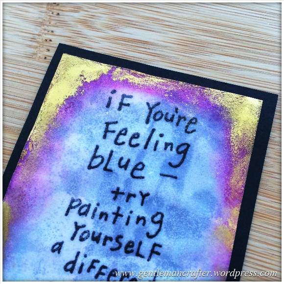
Yup, I liked it, but thought that I could create another with a different colour way so I came up with this one.

I first re-inked the sentiment and stamped it onto plain white cardstock.I then used some pink and blue Versafine inkpads to shade the edges and a little in the centre.
This turned out quite basic and flat so I coated the whole thing in embossing ink and chucked on a load of clear embossing powder. After heat setting this it still need a little something – so I inked the edges again and applied another layer of clear embossing powder to “float” the colour.

I liked the gold edging from the previous design but wanted something a little more distressed so this time I used some gold Perfect Pearls and clear embossing ink to apply it to the edges. I then heat set this to “sink” the gold into the embossing powder glaze.
I noticed at this point that the embossing powder was started to create weird clear spots on the white cardstock so I stopped at this point and mounted it onto black cardstock.

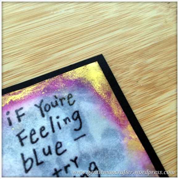
Not too much of a disaster however I would have prefered a “clean” blue in the background – but you get the idea, right?
Ok, so two for the price of one in this post. Hopefully that will turn any frown upside-down! :)
It’s definitely a sentiment that I will be adding to my list of positive mantras – how about you? What uplifting mottos do you abide by?
But listen, I must sign off now as I have more of these little critters to catch up on blogging about.
As always, if you have any comments or questions about this post then please feel free to use the comments section below. Also, If you know of anyone that would appreciate reading this post, there are handy sharing icons below.
Many thanks for taking the time to read about my little creations.
I’ll see you again soon!
J :)

Hi John, as the saying goes “out of the mouths of babes come words of wisdom”. Love the sentiment and I think both colour ways are great. Bx
LikeLike
In all my years of cardmaking I haven’t met anyone who makes ATCs.
What do people do with them?
I love to look at your creations, John, but my mind immediately converts the idea into a card front.
LikeLike
They can be collected, traded or used as toppers for cards :)
LikeLike
Lovely sentiment! I love the Ghandi phrase “be the change you want to see”, but I wrote my own “anti-gremlin mantra” when I was working for the NHS and that kept me sane for many years until I took voluntary redundancy!!! X
LikeLike
Only a child could say that. Lovely thought.
LikeLike
Love it! So simple but brings a smile to your face.
LikeLike
Love the sentiment – what talented, thoughtful youngsters there are out there! Love your designs too, thanks for sharing again.
Carole
LikeLiked by 1 person