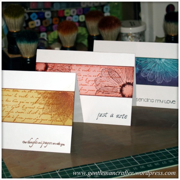
I’m seeing single layer stamping in a number of places right now, so I thought that I’d give it a go and see what I could come up with.
Here is an overview of what I did and how I did it.
First, I am guessing that some of you will know what is meant by single layer stamping, but for those that don’t it’s basically stamping and decorating on the actual card, rather than using any matts, layers or embellishments and building things onto the card.
Here is a card that I made to illustrate that point.

Not sure if you can tell, but there are no layers, matts or other add on embellishments. All of the design comes from the stamping and inking that I worked straight onto the card.
Anyway, I hope that you got the idea.
I chose this “panel” style really so that I could make a clean and contemporary card with a flash of something in the middle. Worked out well I think.
Here is a quick overview of how I achieved it.
First, I drew two parallel lines on the front of the card.

(That picture is in for a prize as being the best picture ever – not)
I drew them in pencil as they are merely guidelines.
I then masked off the outer area leaving the centre panel showing.

I then chose three different distress inks (Spun Sugar, Worn Lipstick and Ripe Persimmon and began blending on the lightest – Spun Sugar.
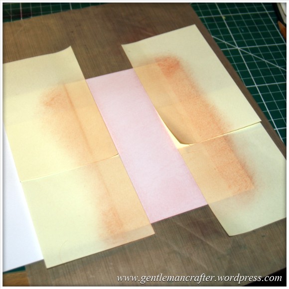
And then the mid tone colour – Worn Lipstick. I didn’t shade the whole area with this, but starting creating a vignette.

And then finally the darkest tone – Ripe Persimmon. Again, only the other edges were done with this colour.
I also added a little Aged Mahogany but just over the corners of the central panel, mostly to accentuate the shading of the other three colours and complete the vignette look.

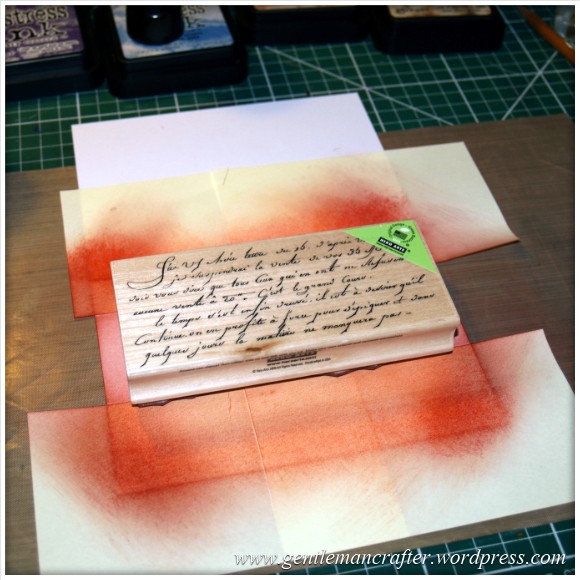
I then grabbed a large script background stamp (from Hero Arts in case you were wondering) and used the Ripe Persimmon distress ink to plonk a patch of text right in the middle of the panel.

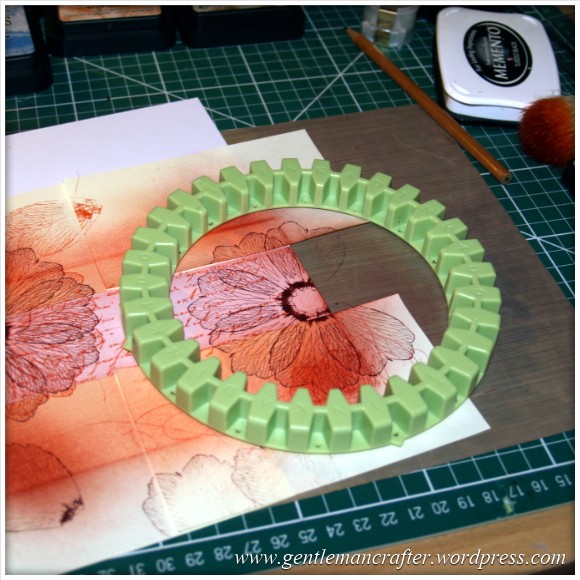
Now it was time for the Inkadinkado Stamping Gear to get involved. I chose the circular wheel and a flower petal stamp. Using the Aged Mahogany distress ink I stamped into every fourth notch (because it was quite a wide petal).

I then moved the wheel to the other end of the panel and repeated this design.
So that was all of the stamping on the centre panel done. Time to remove the masks.

Not bad, but I felt that it needed something to “frame” the centre panel. Now, I could have used a black micron pen to draw two lines across the design but I wanted something a little bolder and that worked with the colour scheme so I searched my Spectrum Noir collection and found that the DR7 pen was a good match for the Aged Mahogany distress inkpad so I used that to draw the two lines.
Here is what it looked like.

Right, just a sentiment to finish I think. Because I had used a scripty background I searched my stash to find some text that had a font to match, or at least not look out of place.
I like to do that as it ties the design together a little more.

So there we have it. A fairly quick and trouble free project.
Oh, I’m an idiot, I forgot to tell you the size again. This one was an A6 card (UK sizings here), but I see no reason why the style could not be adapted to suit any size of card.
Here is another look at this one finished and stood up.
And here are a few more experiments that I made using this technique.


By the way, it did cross my mind as I was making these cards that there are advantages to doing things this way.
First, I could invest most of my money (if I were just a rubber stamper) in the stamps and inks as the only base card that I would need is white.
The second is that it really does fire up the imagination – which is the part that I enjoyed.
What do you think – is this your style of project? Do you like the idea of a creative challenge like this?
Well, that’s about it for now. As ever, if you have any comments or questions, please feel free to use the box below.
Thanks again for reading.
J :)

Love these and must find the time to play with my stamping gear stash xxxx
LikeLike
VERY ELEGANT YOUR CARDS ARE VERY UNFUSSY,BUT VERY CLASSY SOMETIMES IT’S KNOWING WHEN TO STOP AND WALK AWAY
LikeLike
Great card John, nice not having to mat and layer everything all
the time.
LikeLike
It certainly was liberating as I didn’t have to worry about getting it all right.
J :)
LikeLike
Hi John,
What a lovely technique. Thank you for so much inspiration.
Carol
LikeLike
I love your cards John, and your instruction is so easy to follow thank you for sharing . Nita
LikeLike
What a wonderful tutorial, thank you John, your cards look so effective. xx
LikeLike
Beautiful, simple and elegant cards … I’m off to have a go at this technique right now and hope I can make something that looks as good as these. Thanks for the tutorial – they really do look as if they are matted and layered but without the bulk this can add (and probably without the extra p&p you’d have to pay to send them too) …. love it :)
LikeLike
How did you get on with your experiments Diane?
J:)
LikeLike
lovely card John will work for so many occasions ,I nave a sympathy card to make ,I think I will nick your idea hope you don’t mind. m m
,
LikeLike
Love this look and often try to do this, however I always get a smudgey ink blob or finger print. They are stunning though x
LikeLike
Crisp, Clean and Professional.
LikeLike
Wow John, I love this one. I used to make beaded jewellery but have recently decided to try card making, being unable to work to to bad health and trying to survive on a very low fixed income, I’m finding it hard to get together all the equipment I think I need. I managed to get a secondhand Wizard die cutter…but can’t afford any dies yet. Now I know that I can make a beautiful, elegant card using stamps and ink, so my wish list is now changing, and as soon as I can save up I’m going to get the Inkadinkadoo set, some distress inks and some alcohol pens. On that subject, would you say that Spectrum Noir are better than the Promarker, or is it just a case of getting the colours you want and not worry about the make?
Bejay
LikeLike
There are some people that will swear by a particular brand of permanent marker however I think that it depends on what you hope to achieve with them and how many you will want over the coming months.
The pens are often available individually so it might be worth just trying one from each collection first to see which you like the feel of and which you feel will benefit your crafting and then build your collection gradually.
Another good tip is to try and match (or at least coordinate) your pen colours to other things in your collection, like your favourite colour of inkpad and cardstock. This way at least you know that it will work with what you already have.
Hope this helps.
J:)
LikeLike
Thanks, John. That helped a lot. My local art supplier sells promarkers individually so I can try a couple out, and then find somewhere that sells Spectrum Noir individualy as well. One thing I did notice was that the SN do have lovely matching sets like ‘skin tone’ and the like, which I think takes the guess work out of which you need to buy,
Looking forward to the next card you show us :)
LikeLike
Thanks once again john for taking time to show us in your blog lovely work xxx
LikeLike
Great cards, definitely more my style. I love making single layer cards with mandala stamps, so using the stamping gear gives so many more variations and you’ve given us some lovely ideas, Thank you.
LikeLike
Hello John
Your cards are fab. Really like them and this technique is very effective.
How’s all your non-finished projects coming along – thanks for that posting glad I’m not the only one who has many different projects on the go at the same time. Thankfully, I don’t have as many started projects as you – I’ve started quilting, in the middle of a granny square baby blanket and have numerous cards to do for the next week or so.
Thanks for your inspiration.
Diana
LikeLike
Thankfully working my way through a few this week Diane.
J:)
LikeLike
I love this, this is right up my street. I’ve only got the circle beginners set and so i think i will give this a go right after i get some distress inks!
LikeLike
Another great idea John I love it going to “borrow” the idea for christmas cards that I need to post thank you and please keep the creative ideas coming xx
LikeLike
Wow, I Love this John! You can’t tell from the photo that it’s single layer.
Will definitely be trying this, it looks so elegant.
LikeLike
Love the clean and simple look of these cards John – the turquoise and purple look stunning together.
LikeLike
I love these samples J, one layer stamping is such a useful idea especially for the coming Christmas season. It’s so expensive to send cards these days with that irritating ‘depth gauge’ they now use at the Post Office instead of weight as it was! so this style keeps the costs down that way too :) All three of your cards above are gorgeous, thanks for sharing.
LikeLike
Fantastic – will give this a go x
LikeLike
Fantastic – will give it a go x
LikeLike
This is not my normal style as I normally go heavily on the matting and layering. However, I have to say I love the relative simplicity and am going to give it a go. I think it would be a quick, simple and effective way of producing notelets in sets to use as gifts or to sell for charity.
LikeLike
Definitely one way of achieving good profit from your cardmaking.
J:)
LikeLike
…sinply…classy :) Very elegant! x
LikeLike
Fantastic. I really thought you had matted and layered it onto the card. Well done
LikeLike
Fabulous John :) x
LikeLike