
Day 21 – 30 Days Of Card Making
Wow, three weeks down and still going! Hope you aren’t too bored with this yet.
Regular readers of this blog will know why I am doing this mini challenge in order to reunite my mojo with my craft space. To follow the full journey, you can find all related post in the 30 Days Of Card Making archive.
Ok, on with today’s creation.
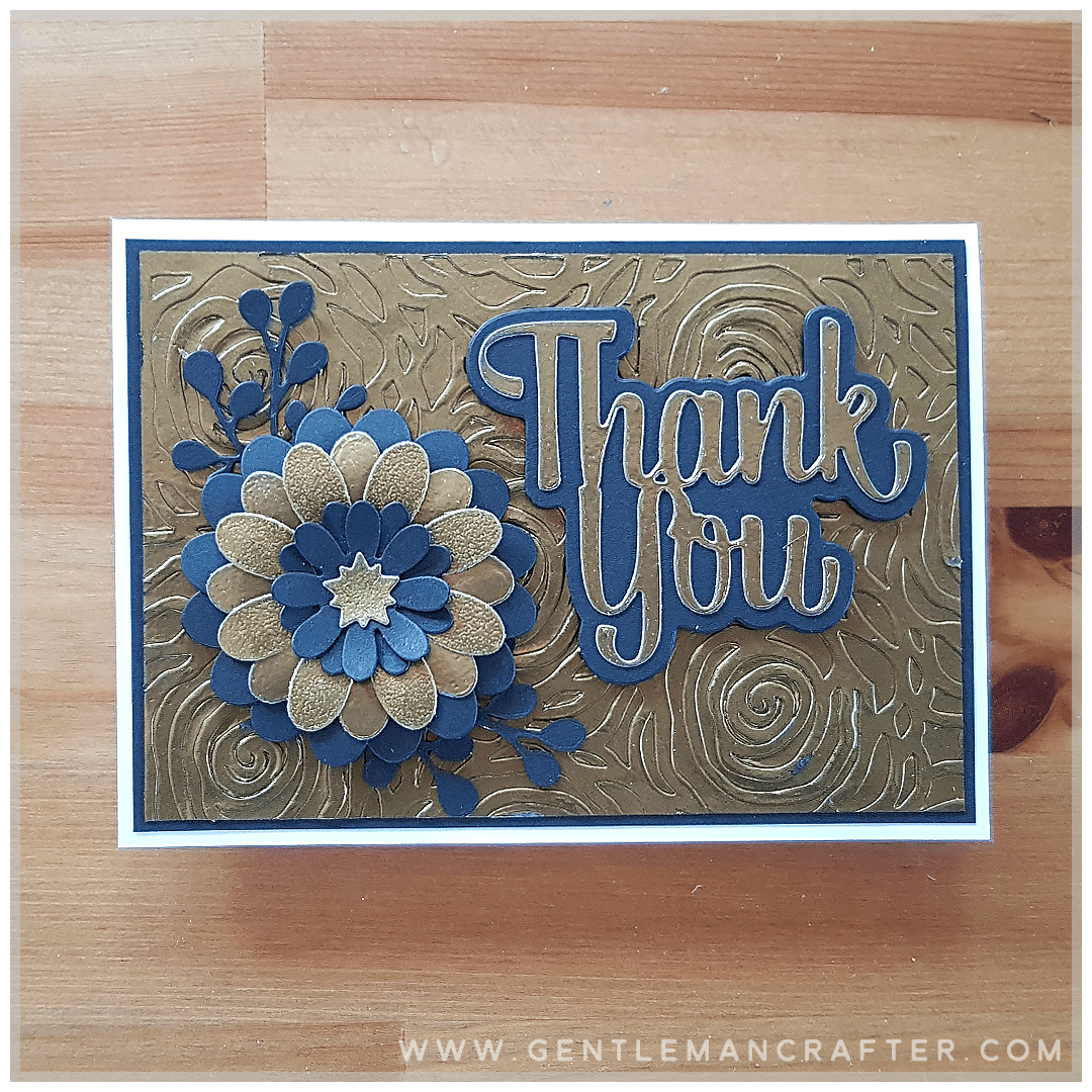
Another one of those embossing powder creations today. First a few sheets of A6 card were coated in heat embossing powder and heat set.
Craft space wanted some embossing folder action and mojo had a rummage through the die box.
That ended up meaning that the first sheet was embossed with an embossing folder and the second was die cut with the word and one layer of the floral focal point.
The third, on which “we” had used a different grade of gold powder, was also die-cut with some of the floral elements.
Black card stock was used to die-cut all of the shadow layers.
This was then all layered up and stuck down.
It’s certainly a statement piece, isn’t it?
Ok, there we are, day 21 complete! Phew!
If you have any questions or comments, please feel free to leave them in the comments section below.
I look forward to hearing your thoughts.
Thanks for reading today’s progress. Hope you will join me tomorrow to see how mojo, craft space and I get on with your journey.
Much love,
J x.
Byeeee!

I love blue and gold, it brings warmth and depth. yet another beautiful card.
LikeLiked by 1 person
What a beautiful card John. Love the colours. Lots of work there x
LikeLiked by 1 person
A beautiful card John. Love the colours. Those 21 days seem to have gone quickly.
LikeLiked by 1 person
The colours look great together, like someone earlier was saying, it’s usually blue with silver, but it just goes to show it’s good to stir things up.
Coating the sheets before you started, as you said in the how you did it, was that just swiping an embossing pad over the card and liberally scattering embossing powder, or is it a bit more technical than that?
LikeLiked by 1 person
More like “squishing” the embossing pad on the card, but yeah, ink on, powder on, shake off excess, heat. Nowt technical at all.
LikeLike
I don’t normally like blue and gold together, I tend to put blue with silver, but this has shown me that blue and gold can work well together, very well. I like it alot.
LikeLiked by 1 person
It’s my rubbish photo, that’s actually black. Lol. Glad you liked it anyway :)
LikeLike
Oops! Strange what technology can do in certain light lol
LikeLiked by 1 person
I adore this card! So simple in it’s finish but nevertheless absolutely stunning in it’s design. I am certainly enjoying your crafting journey very much and have taken much inspiration from your ideas. Looking forward to tomorrow! X
LikeLiked by 1 person
Nope, certainly not bored! I really must try some of your ideas, but I’m still ADDICTED TO RESIN! Lol! Wxx
LikeLiked by 1 person
Hi John.What a gorgeous card. I certainly am not bored. Can’t wait to see what you three create next. You’ve built up a lovely varied collection of diverse cards and it will be an excellent source of inspiration for when our craft space and mojo decide to abandon us, which it does from time to time,. Kath x
LikeLiked by 1 person
Wow. Like the idea of dfferent grades of embossing powders John, that is inspirational. May help me fall back in love with some of the courser ones I’ve got lurking in the cupboard. Brilliant idea thanks.
It certainly looks like the three if you are getting creative and playing nicely -very nicely. Keep it up.
LikeLiked by 1 person
Lovely John, it’s good to have some new ideas xx Sandra
LikeLiked by 1 person
Like this one very much John. It looks like the 3 of you are getting on well.
LikeLiked by 1 person
Love the colour and texture combination of your lovely card today John. I always am searching for ideas for Men’s cards other than the stock car, train, plane, fishing……you know what I mean….usually end up doing a bit of steam punk or shapes embossed out of old larger or discarded tonic tins minus the gin, backed with brush strokes of different colours of ink or paint. The point I am trying to make is this would be ideal for men or women’s cards. I love it. Reta Retro. X🦋
LikeLiked by 1 person
Looks to me like you are winning with this one John love it
LikeLiked by 1 person
Beautiful John
LikeLiked by 1 person
Just my style, lovely. I hope the other two are letting you get a word in edgeways. xx
LikeLiked by 1 person
Lol, I’m just glad they’re getting along!
LikeLiked by 1 person
Not board John, i’m enjoying seeing your daily creations. They are inspiring and uplifting. Great card again today xx Hazel
LikeLiked by 1 person