Welcome to the fourth and final part in the Magazine Medley mini series of blog posts,
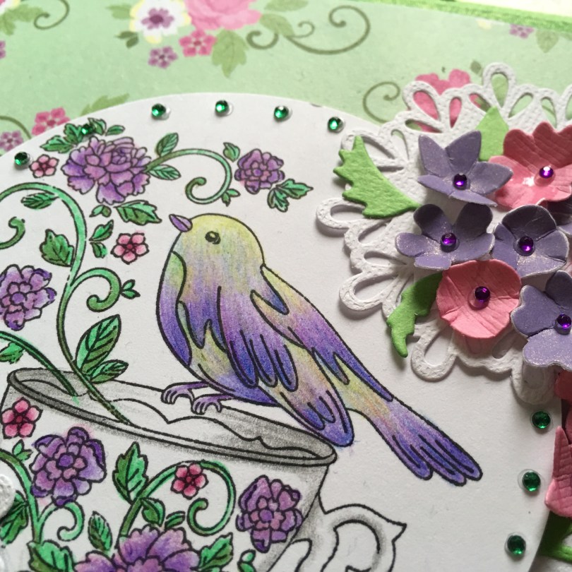
For this creation I have tried to take green and purple and make them work!
I think I just about made it happen too!

There are a couple of things that I would have done differently however the overall result was quite pleasant.
The colouring was a little tricky as I was tying to get a clean blend between two secondary colours which, as we all know usually ends up as brown.
I used a blending pencil and the white space between the colours to help with this.

Not too shabby.
The same colour coordination concepts were used to pick matting and layering colours and these were also used within the large floral arrangements.
I was however worried that the floral arrangements might get ‘lost’ in the busy background so I decided to use a couple of doily dies to cut some white card stock for them to sit on,p.

The compulsory gems were added as a final touch.

Finished!
Like I said, I quite like this colour combo. It’s certainly a step away from the usual at least.
So, what do you think?
Would you have chosen this colour scheme? If so, would you have changed the layout?
Anyway, there’s an All Counties Challenge diary blog post coming up a little later, so you’ve probably enough time to grab a cuppa and a biccie before heading back.
If you’ve got to head off, please feel free to pop by at any time.
Au Revoir!
J :)

Really pretty card. Thank you for the tip about using a white pencil. Xxx
LikeLike
Fantastic! Found your blog looking for inspiration from these magazine stamps and love your work.
LikeLike
Another beautiful card John. This one is my favourite. The colours are perfect and thank you for the tip on blending the green and purple.
X Chris
LikeLike
Hi John, It is absolutely beautiful. It has made me stop and think about the colours I use. I normally go for autumnal reds,greens, browns.I need to venture out of my comfort zone. I am going to try and replicate what you’ve done and make a cushion cover. Thanks for the inspiration. Jan x
LikeLike
Love this one as well as yesterdays! I agree the doily’s set it off nicely against the busy background. A good tip thanks for sharing, will give it a go if you don’t mind. I struggle with busy backgrounds & have lots sitting in my stash, never knowing how to use them!
Happy crafting
Carole
LikeLike
Love it John. Great combo. must say I would not have thought on these colours together. Really fresh and bright.
LikeLike
Hi John
I love it! You done such a great job shading between the purple and green, not at all easy. I think it all goes so well together.
Looking forward to the diary post. I’ve had a very long weekend so far but the best one I’ve had in a long time. Me, my best friend, lots of chocolate and an Alice Cooper concert. Hopefully I’ll read the post before I flake out!
Hugs, T x
LikeLiked by 1 person