Well, hello again :)
Number three of four in then Magazine Medley series coming right up!
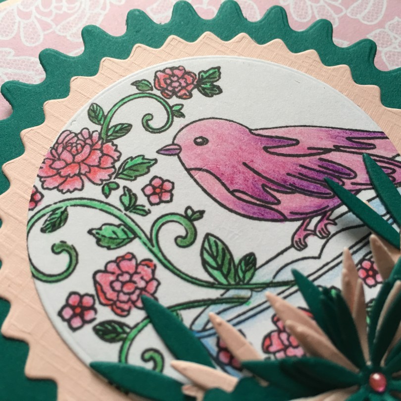
A very quick and simple one this time around.
I will pre-warn you however that my camera decided to add a green tinge to all of the pics for this one so the pink card stock looks cream coloured – still works though so I didn’t retake them :)

Again I coloured the design according to the colours in the background.
The card stock was also chosen to match.
The rosette layers and pennant were from the freebie die set that came with the Die Cut Essentials magazine. I think I might be using these a lot as I love them.
I went back to the Britannia Chrysanthemum die set from my existing collection to create the floral arrangement at the bottom of the rosette.

Hmmm, defo see the difference in colour tones in this pic, the ‘cream’ card stock is actually a light pink colour.
Technology eh? *tuts* Lol ;)

Right, that’s another one done.
Hope you liked it despite dodgey photos!
I’ll be back with the fourth and final part in this series tomorrow – join me for a cuppa then?
Bye for now.
J :)

Hi John
Pink and green is a nice combination. Your light pink cardstock that looks cream to you looks a kind of peachy colour to me! Regardless of that the colouring is lovely and the stamp/ papers all work well together.
Hugs, T x
LikeLike
Good evening John! I succumbed whilst shopping today and purchased the magazine with the cup and bird freebie. Nice embossing folders too. I’ll have to sit down and try to create something, but not now – its bedtime. Regards Lorraine
LikeLike
Love this one John. The colours look good!
Happy crafting
Carole
LikeLike
Trying again
LikeLike