
So, the other week when I had a little “spree” at Wee Stamps, I actually bought several fairies so I thought that I’d do another colouring/card making Monday Mash Up with another one of the designs this week.
By the way, if you didn’t catch the last “colour in a fairy” blog post from me, you can visit it here – Monday Mash Up – Everybody Loves A Fairy.
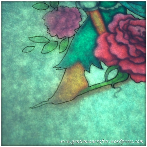
Ok, leaping straight in with the colouring on this one (as this took quite a while – several evenings in fact).
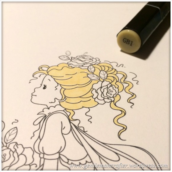
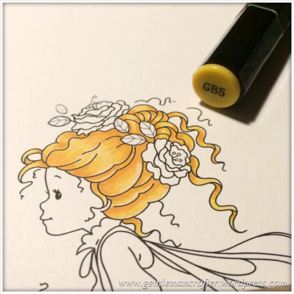
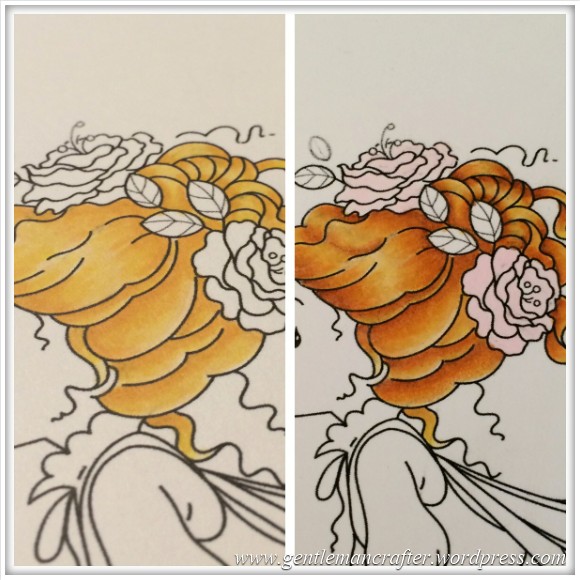
I started out with the hair as this had given me jip on the last one.
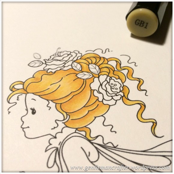
I started with the GB1.
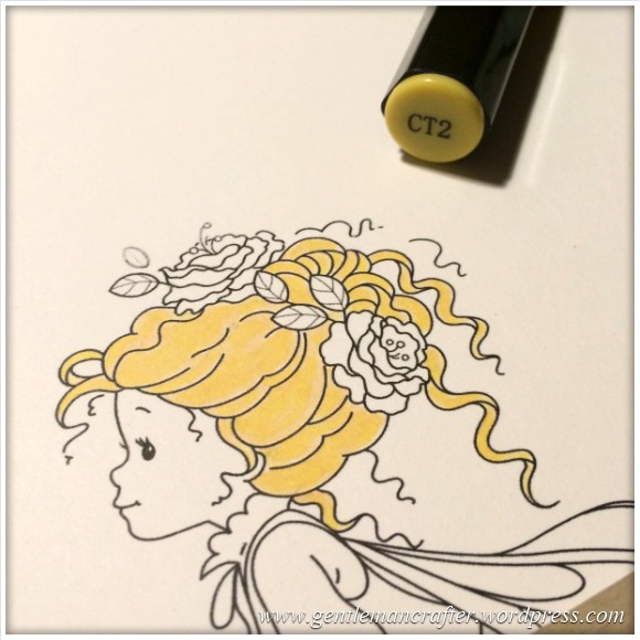
Blended in a little CT2.
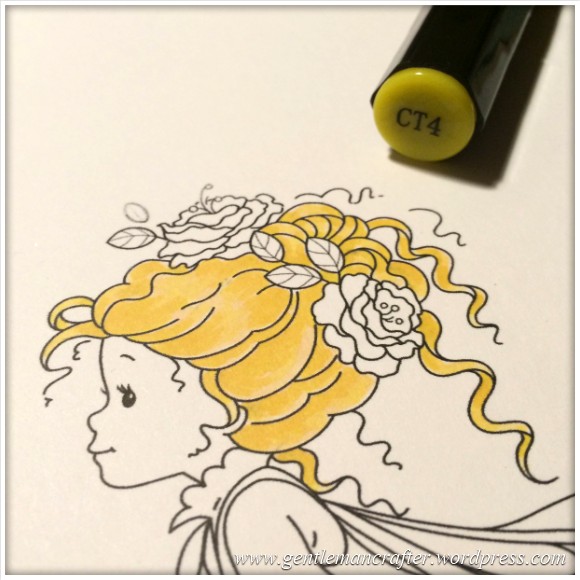
Added some CT4 to make the colour a little richer.
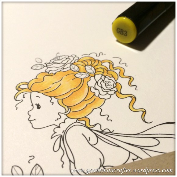
Then went in with the GB3 for some deeper shadowy areas.
And then some GB5 to again strengthen the shadows.
Finally I blended it all in with the GB1.
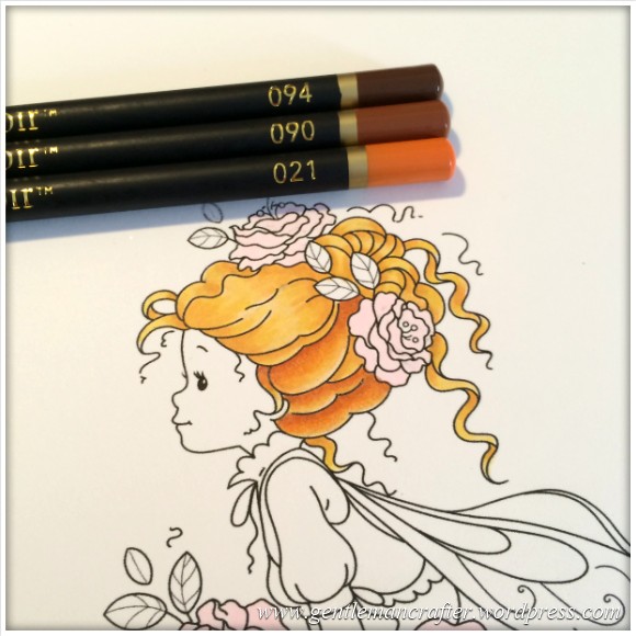
So, I was happy with the blending and shading but I didn’t feel that the colour was strong enough.
Having bought the Spectrum Noir pencils a while back, and used them for various colouring projects, I hadn’t yet got around to layering them on penwork as suggested by Leann Chivers.
So I had a root through the collection to find some shades that I thought would work well and chose the 021, 090 and 094 pencils and began shading. I was pretty surprised at the result to be honest.
You can see the difference that was beginning to show in the next picture.
I did use the Derwent Blender pencil rather than a blending solution for the blending on this one though as there were some quite fine areas and using a blending pencils meant that I could work into all of the design.
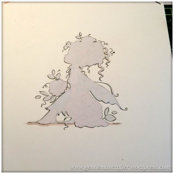
Anyway, I carried on and this was the result when done.
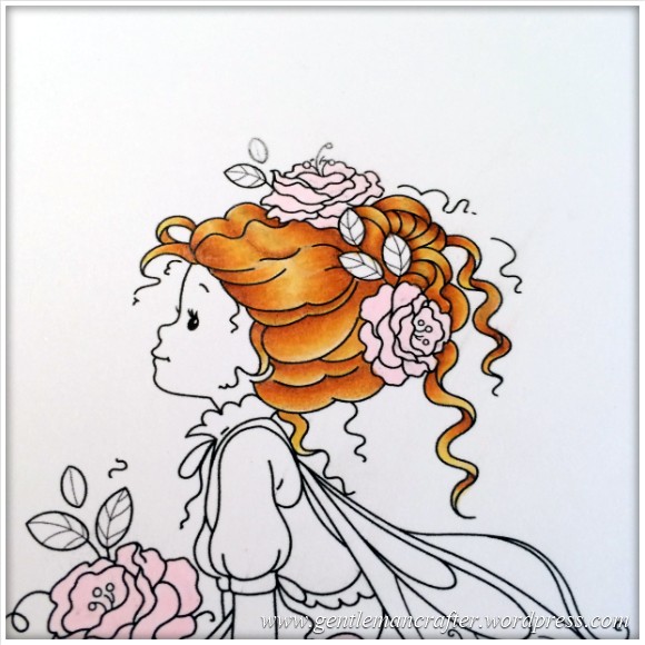
And here is a side by side comparison of the pens vs pens/pencils.
With that technique in mind I went on to colour the rest of the design.
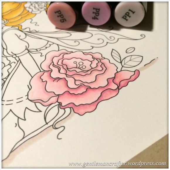
For the flower I used the PP1, PP4 and PP5 pens followed by the 036, 040, 038 and 083 pencils.
Here is the pen part complete.
The next picture shows the complete flower and also me starting to work on the skin with the FS1 pen.
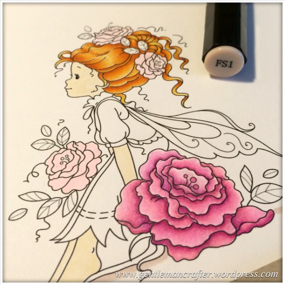
To add some depth and shade to the skin I used the FS3 pen to trace the outer edges of the skin areas.
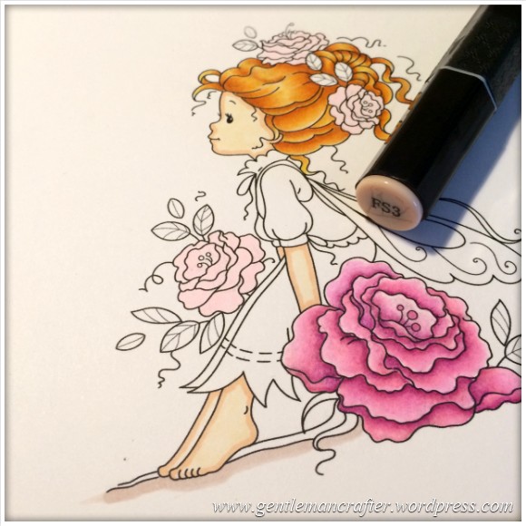
I then used the 085 and 008 pencils to add a little more “tone” to the skin.
For the dress I started with the GT1 pen and added shadow areas with the BGR2 pen.
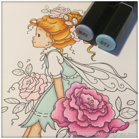
I then worked in to the dress with the 062, 063 and 055 pencils.
Now, at this point I got lost in my own little world listening to Radio 4 comedies of old (Navy Lark, Round The Horne, Listen To Les etc) and just colouring, so there are a few stages missing in picture form however here is a quick description of what I used and a picture of the completed colouring.
The Wings – Overall layer of IB1, followed by shading with the 065, 068 and 066 pencils.
The leaves – Overal layer of LG2 followed by shading with the 056, 058 and 047 pencils.
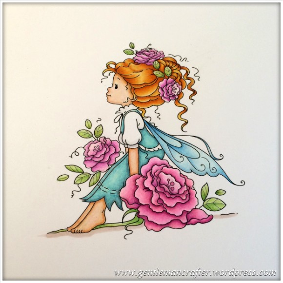
Being totally honest, I have to tell you that this took quite a few hours of work – in fact several evenings – but I think that you will agree, the result was worth it. It’s a great way to round off the last couple of hours of the day and relax before heading to bed.
So, with the colouring done it was time to think about the card front and how that was going to be done.
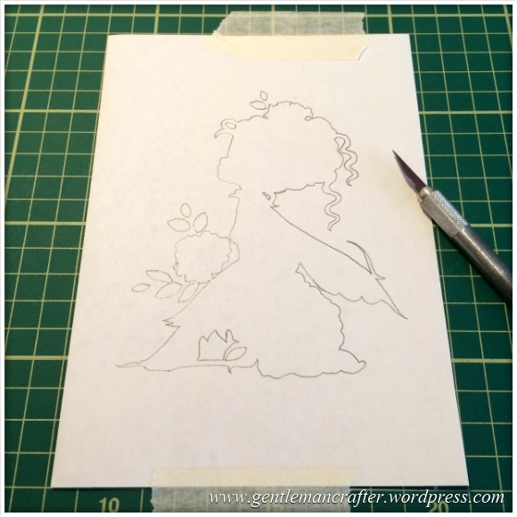
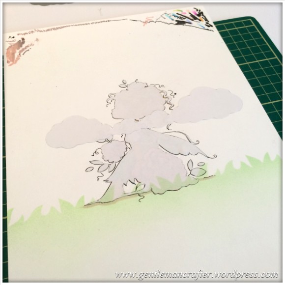
I did have in mind that I wanted my little fairy sitting in a grassy meadow looking up into a lovely summery sky, so I need to create a mask.
I initially tried to create this by tracing and silhouetting the design on some masking film and scanning it with my Brother Scan N Cut.
Here is the traced design.
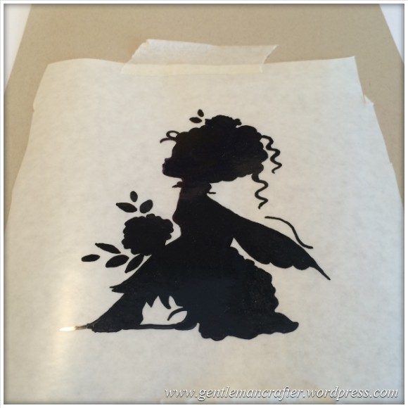
Unfortunately, although the machine recognised the outline just fine, it really didn’t like my masking film. :(
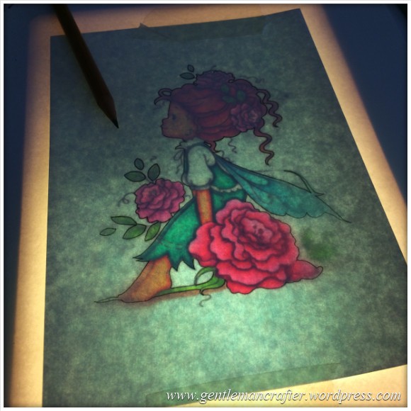
I therefore went old school and got out the light box and some masking sheets from Inkadinkado and traced the design onto that and cut it out with scissors.
Yes, I did say that I cut it with scissors and the pic above shows a craft knife. Well, that was taken before I discovered that Inkadinkado masking sheet doesn’t like a knife being dragged through it.
Anyway, here is the mask completely cut out and stuck over my coloured design (please don’t rip it, please don’t rip it).
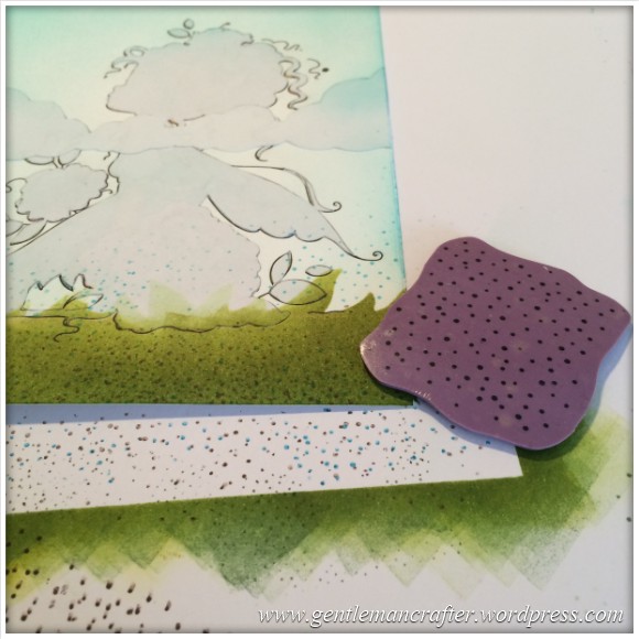
I then went back to the Brother Scan N Cut and cut one of the built in borders, which was a grassy horizon line.
Using this as a mask I got my Perfect Spritzer out (stop sniggering) and a Meadow Green pro marker and puffed a light covering. I then added a quick spritz from a Grey Green nearer the top of the grass to give it some depth.
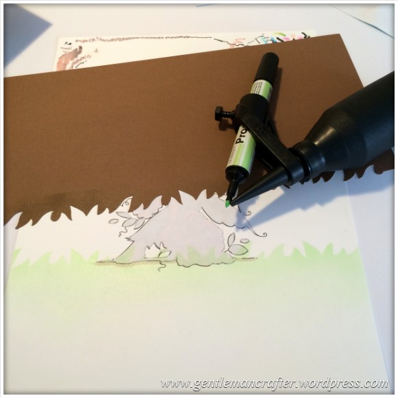
I created some cloud masks and added these to the design and then began spritzing over the sky area with a Pastel Green Pro Marker.
The result was quite light.
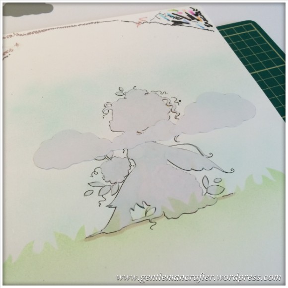
I therefore had to think a way of darkening it a little without giving myself handcramp from spritzing (no, seriously, stop giggling).
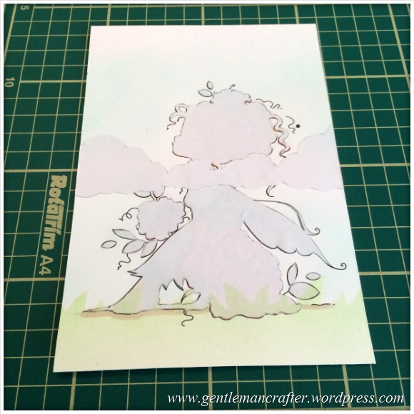
I finally decided to use some Adirondack inkpads to help so I chopped the card front down to size (as I wanted to blend the edges).
The blending foam was great for getting a nice coverage (oh, I used the Pool shade of Adirondack Brights for the colour).
I also chucked on some Lettuce and Meadow in the grassy area at the bottom, using the grassy mask again, just to tone it in with the upper area.
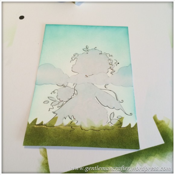
Looks a mess now doesn’t it? Lol.
Anyway, I also used a dotted pattern stamp from See D’s Mini Deco Backgrounds to add some stippling to, and just above, the grassy area.
It was then time to remove all of the masked areas and see what it looked like – I carefully peeled the masks away muttering, “please don’t rip it, please don’t rip it” – I nearly squealed when I had removed all of the masks and gazed at my little creation!
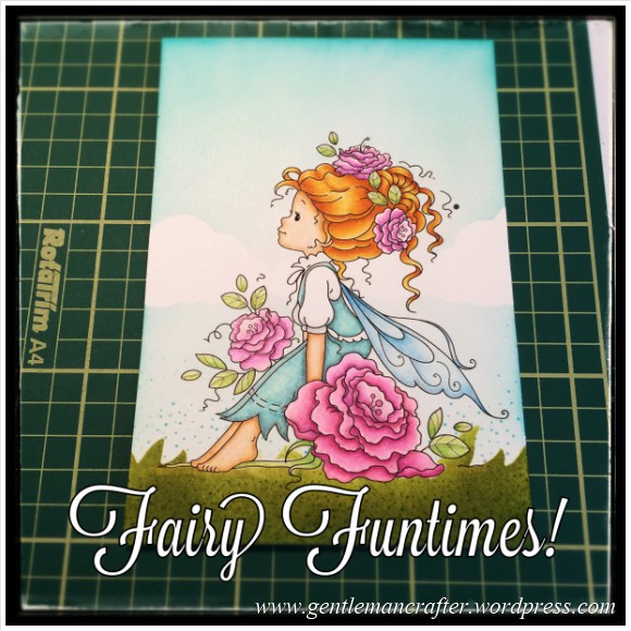
Lol, yes, Fairy Funtimes all round!
After doing the completely embarassing-if-seen happy dance, I started to think about the construction of the card front.
I think that I remember wanting it simple. Lol, Yeah, that.
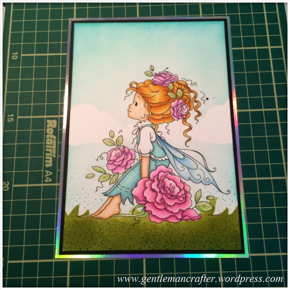
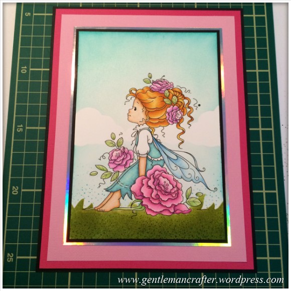
First was a “tiny” bit of matting and layering.
And then a little more …
Ok, stop now.
All of the layers were cut using different sizes available to me on the Perfect Layers rulers.
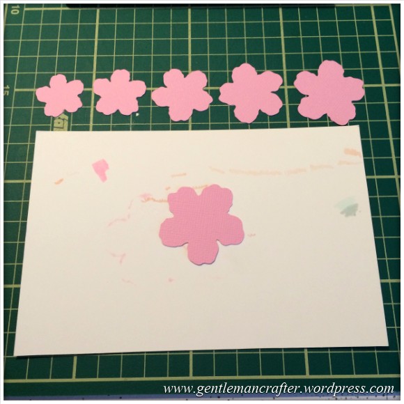
Next I felt that it needed a little ‘something’. I liked the flower on the design and thought that it might be cool to create a three dimensional one to add to the design. I didn’t however want to do the traditional decoupage style of layers and after a good old rummage I found that I didn’t really have any dies or punches of the right shape and size.
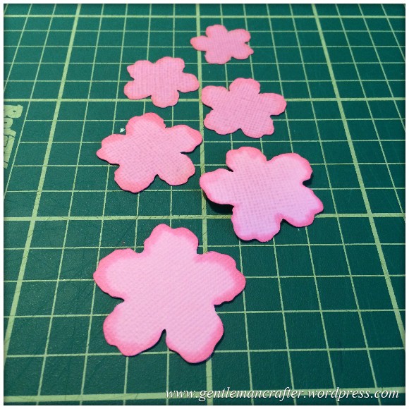
I therefore turned to my Brother Scan N Cut again and found the perfect shape so cut it from some cardstock (that I had selected based on it’s colour match to the colouring in) and cut several different sized versions of the same shape – like so…
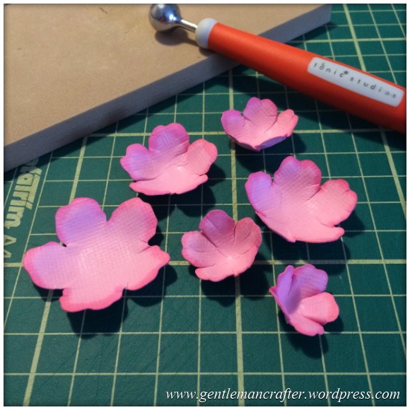
To give them a little dimension I did two things – colour and shape. Sounds like I’m starting up my own salon doesn’t it? lol :)
To colour I started by giving the flower a good saturating layer of the Spectrum Noir blender pen.
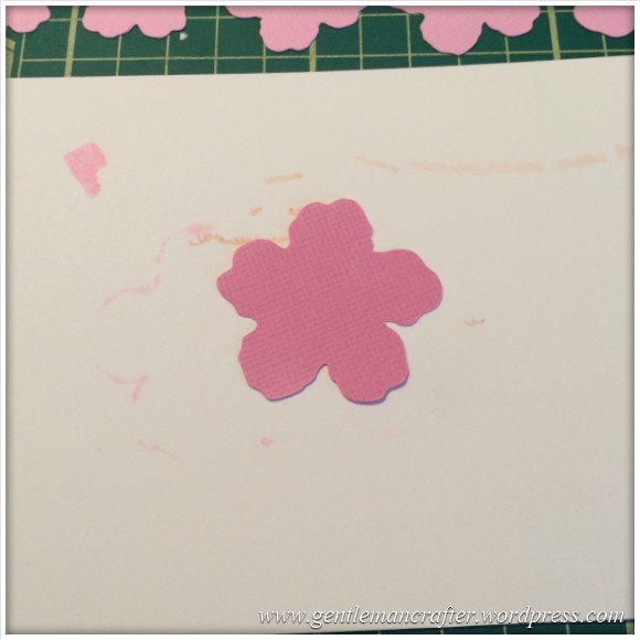
Lol, brilliant, you can really SEE that CLEAR fluid there can’t you?!
Next I touched the tips (naughty) with the PP5 Spectrum Noir pen, or was it PP4 – um, either would have done to be fair.
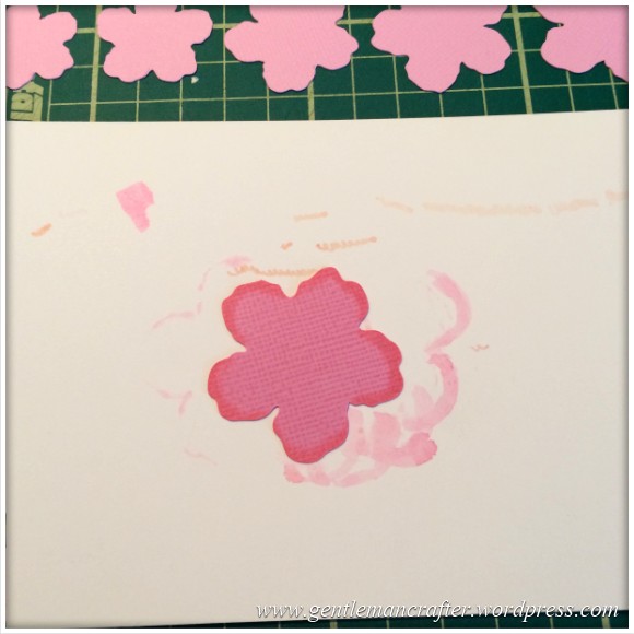
And to finish I gave it another good going over with the blender pen.
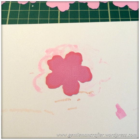
Tip: If you’re giving this colouring method a go, please work on a spare piece of card or several layers of copy paper as the ink from the pens will bleed through the flower.
I repeated this for all of the layers.
And here they all are, lining up ready to be shaped – atteeeeention!
The shaping came courtesy of a good old rub and roll from the Tonic Studios flower forming tool set.
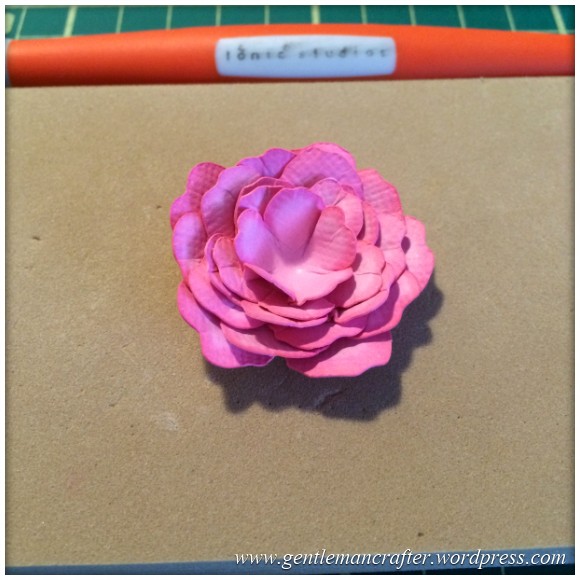
Once shaped I stacked and stuck them all together.
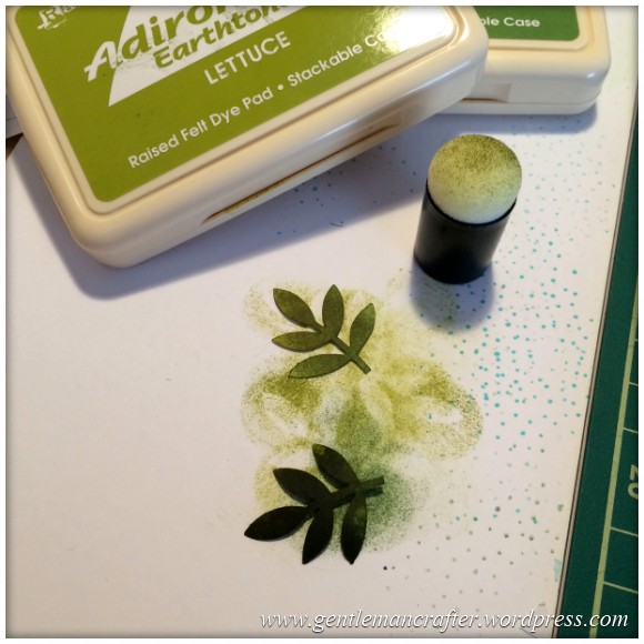
The rose, I thought, would look a little out of place just on it’s own so I grabbed a Martha Stewart leaf punch and then inked the leaves up with the Adirondack greens that I had used earlier.
The sentiment choice was easy, and it’s all thanks to you lot.
You’ve all been so positive and kind to me of late, through Facebook, Twitter and on this little blog that, “Thank you for your friendship” (that I found in my box of sentiment stamps) was just the perfect thing.
I stamped it onto a strip of lightweight card that had been folded over.
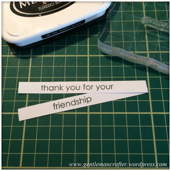
I did chop a triangle into each end of that to create a sort of flaggy/pennanty thing.
Anyway, I then went on to pop it altogether and piff, paff, poof! Here she be…
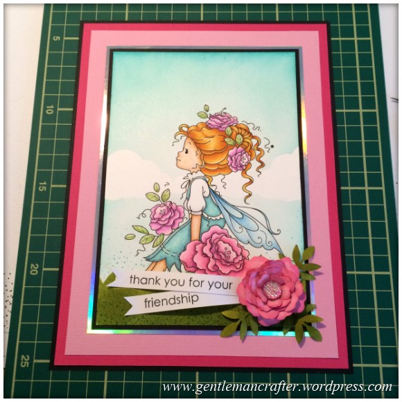
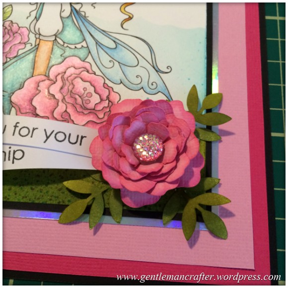
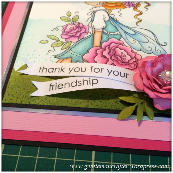
Oh, yeah, forgot to say, I popped a sparkly thing from Hobby House into the rose to give it one final touch.
So, what do you reckon!?
I’m pretty proud of all of my choices on this one.
If you liked this one and want to see another “colour in a fairy” blog post from me, you can visit it here – Monday Mash Up – Everybody Loves A Fairy.
Anyway, that’s this week’s Monday Mash Up done and dusted. I hoped that you enjoyed coming on that little journey with me.
If you have any questions or comments about this post, please feel free to pop them in the comments section below.
Many thanks for reading and I’ll see you on the next post.
J :)

How do you do it John, what a lovely piece of Art, thank you for your demos it means so much when someone takes the time to help others like you do, I have not got the Scan and Cut yet I am waiting for the next time it is on C&C but when I do I will be looking through your help tips, where did you get your fairies they look as if they area decent size to work with, well done John, I love your work, Cathy x
LikeLike
Great work, I have a LOT of practice to do, keep up the encoragement xx
LikeLike
Hi John, thanks for the colouring demo. I really enjoy all your tips. Would like more on scanncut I still have problems.
Thanks for all your great demo’s.
LikeLike
I do a post most Saturdays. What sort of thing are you looking for?
LikeLike
Love it John. Thanks for all tips
LikeLike
Beautiful! Love the step by step instructions. x
LikeLike
Well I think you have excelled yourself on this on e John, Don’t give it away frame it, it is fabulous.
LikeLike
Wow John, that is absolutely amazing colouring, and I think the little added bits really work and add to the overall effect. I love any fairy image. Bx
LikeLike
WOW WOW WOW absolutely stunning card. Card?… It deserves a frame. Particularly after all the time & effort you have put into it. Well done. I love your blogs & looks forward to receiving notification. You give us so much inspiration.
Happy crafting.
Carole
LikeLike
I am a newby to card making and I love colouring in. I have all the spectrum noir pens and two boxes of pencils but hadn’t tried combining them yet. Definitely going to give it a try. Your work truly is a masterpiece. I really appreciate seeing the step by step instructions.
LikeLike
wahouuuuuuuuuu john j’adore cette carte et votre travail est vraiment magnifique !!!
vous avez des doigts en or !!
je prends à chaque fois énormément de plaisir à lire vos news
savez vous où je peux acheter le “rub and roll” ? je ne connaissais pas ce petit outil
bon lundi et à tres bientôt
LikeLike
Lovely John …your very clever …..stunning work…
LikeLike
Beautiful work John, your “step by step” is incredibly helpful. Cutting the shape with scissors… I would have made a total hash, so I’m well in awe, and recognise all too well the “please don’t rip, please don’t rip”. Happy Monday XXX
LikeLike
Hi John, Just put a watermark through the lovely Wee Stamp finished image or your initials on the image as there are some people who would download the image and use it for themselves. There were issues in a DT about this happening. xx
LikeLike
Absolutely fabulous John.xx
LikeLike
Wow John, this is gorgeous, what a lot of work went in to it,luv Pauline x
LikeLike
Loved the journey with you John. So inspiring and the pencils definitely work brilliantly with the pens. So worth all the time put in. Have a fab day xx
LikeLike
John this card is fabulous l really love what you have done. I am just starting using pencils (Faber Castell Polycromas) with my Promarker pens. So your instructions are well timed and so clear. Be sure to give the card to someone who will treasure it. Thank you again for the information which l am sure will be invaluable. Crafty hugs Ann
LikeLike
Absolutely brilliant. I love the stamp. I have promarkers and some of the spectrum noir pencils but haven’t really done a lot with colouring. This has inspired me to ‘have a go’. Never heard of a Derwent blender. Is this something I need?
LikeLike
Wow , I wish i could colour like that, the image is stunning john.
I like that you added the holographic mat it lifts the image really well. I cant gush enough about the design your talent is endless.
LikeLike
Such hard work and such detail. Amazing. Unfortunately people don’t realise or appreciate how much time goes into making such a beautiful work of art.
LikeLike
stunning
LikeLike
What a beautiful card john how clever and patient you are I bought the scan n cut when first out and used it once and since has been in cupboard as cannot get to grips with it, it frightens me to death lol
LikeLike
Fabulous result John, anyone getting this card from you should be delighted (though if it was *me*, I’d not part with it!)
LikeLike
John this card is amazing and I love seeing all your step by step instructions – this is my style of card that I would like to make – first I need to practice my colouring. I have pencils and copics so hopefully I will get similar results when I use both together.
Thanks for the inspiration
LikeLike
WOW John. What a work of art. Love the colouring. The pencils really make a difference. They´ll have to go on my daily increasing want list though. The flower and leaves really add an extra something. Well worth all the time and effort you put into it. Really beautiful.
Love Val in Spain x
LikeLike