
With two colour challenges complete and a third under way I thought that it was about time that I caught up!
Here therefore are a few things that I created using the colours set during the April & May challenges.
If you haven’t heard of my colour challenge, please feel free to pop back to the original post or see what others made in the Colour Challenge Galleries.
For those that have, here are my efforts.
April
April’s colours were …
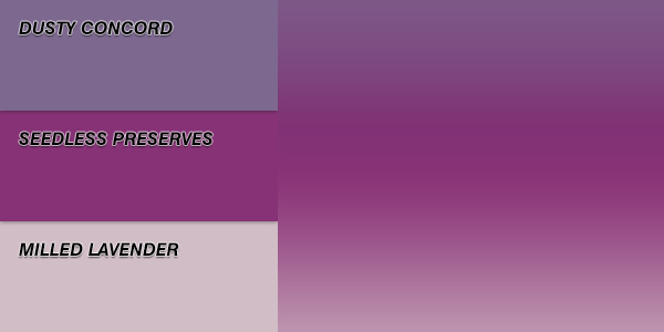
I really enjoyed the simple blended colour palette for the April challenge. It allowed for lots of layered inking techniques.
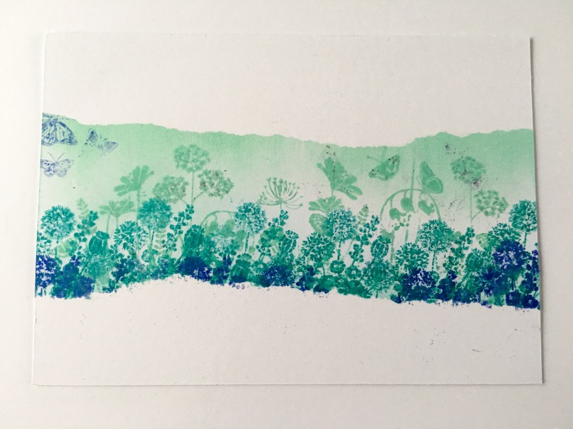
After a brief play I set my mind on what I wanted to achieve and created this inspirational postcard.
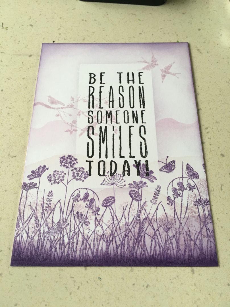
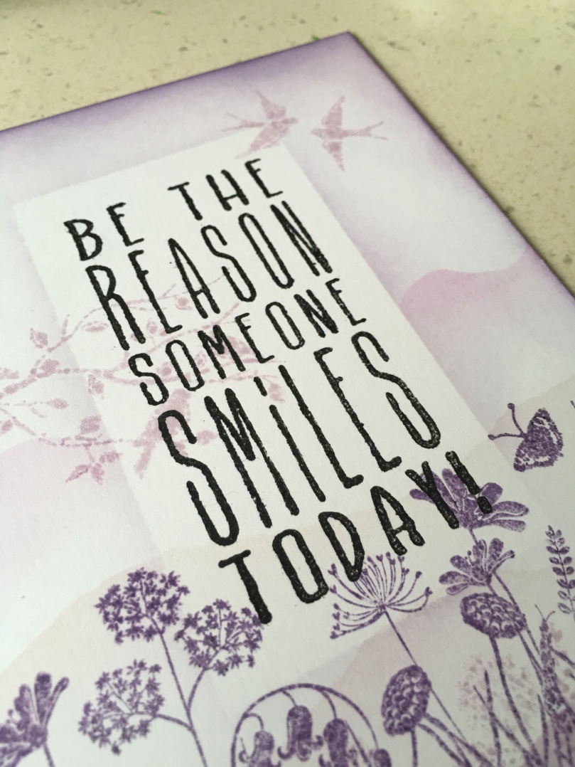
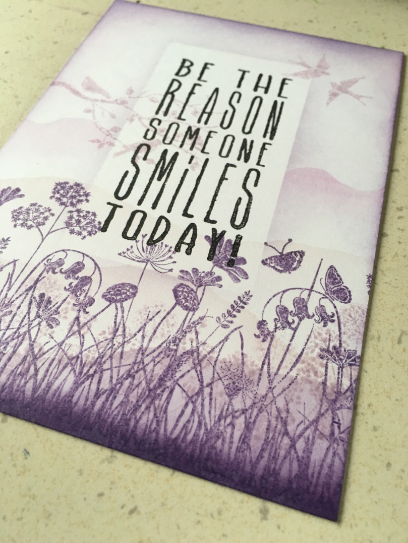
Beautiful isn’t it?
Very simple to create to.
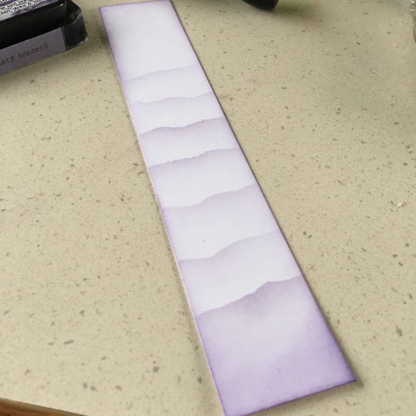
first the vignette around the edge was laid down. Post it notes were then torn and used to mask of the hills. Ink was then brushed over the top of the post it and onto the card stock.
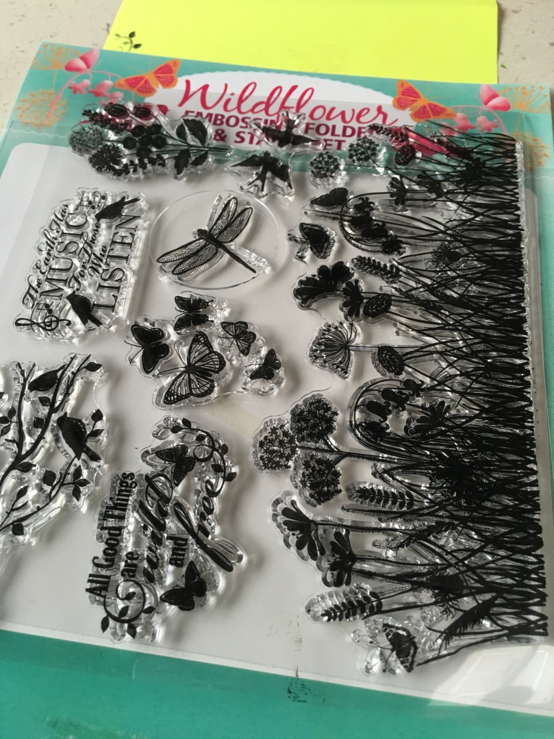
I then used some floral scene stamps from a free set that I got with issue 153 of Quick Cards Made Easy magazine to create the foreground.
The sentiment, from Visible Image, was stamped into the centre with Onyx Black Versafine ink and masked off with a cut down post it note.
Some more distress ink was then blended from the post it note onto the card stock to create a shadow around the sentiment.
To finish I brushed the edges of the card stock over the surface of the Onyx Black Versafine inkpads to get rid of the stark white edge.
Finished!
This idea was then applied to a tall off cut of white card stock …
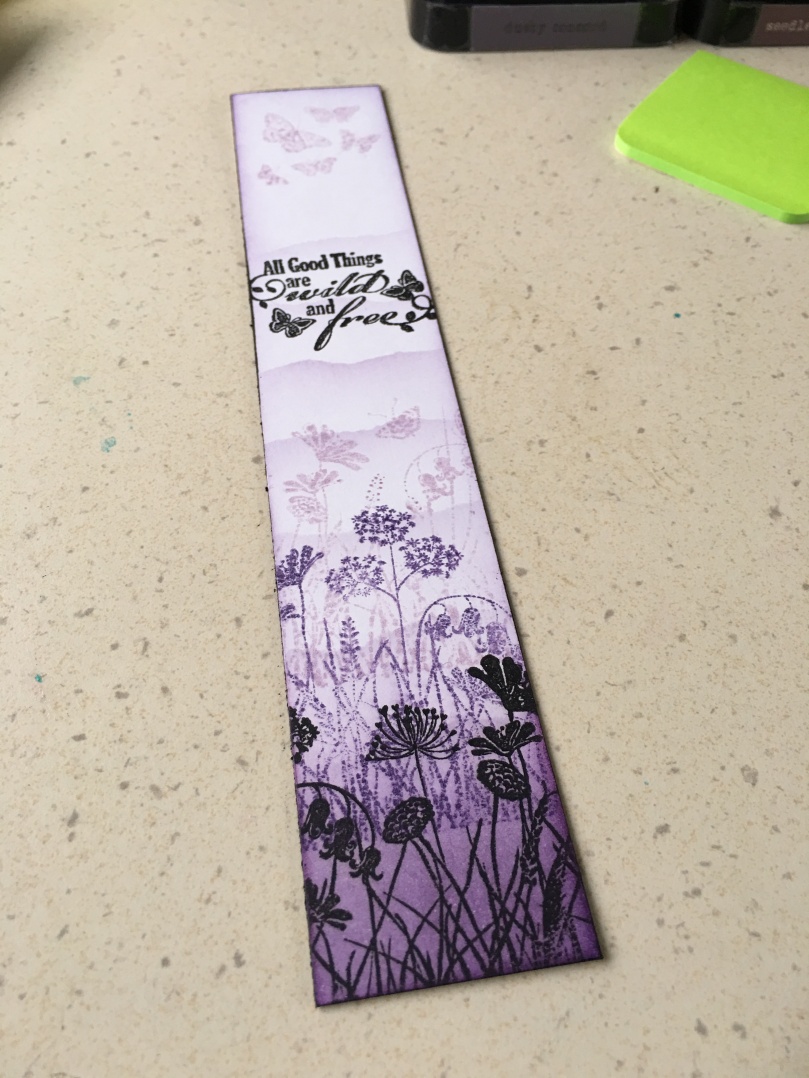
I think that it would make a lovely bookmark, don’t you?
Here is a quick look at the process of these creations.

For those curious about the stamp set used, here is a quick look at the full sheet.
Ok, so that was April – now on to May!
May
The choice of colours for May were …
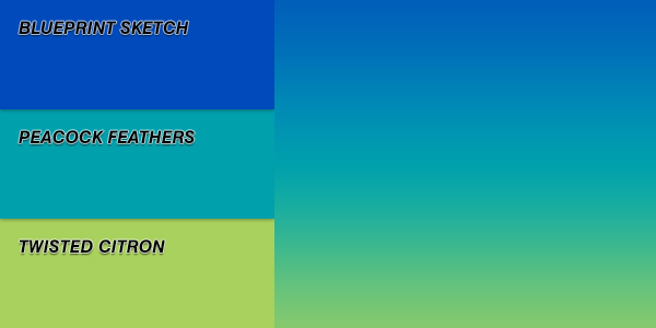
Unfortunately when I set this challenge I didn’t check to make sure that I had all of the colours so I had to replace the Twisted Citron with Cracked Pistachio.
I didn’t let this stop me creating though and was very pleased with what I created in the end.
The first design started out with the sentiment (from a sheet by doCrafts).
This was then blended and stamped around.
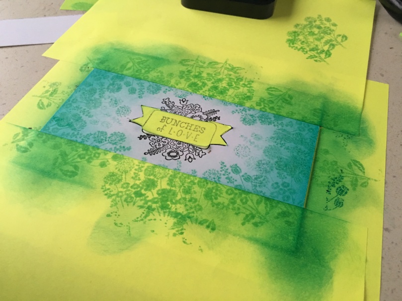
Before removing the mask.
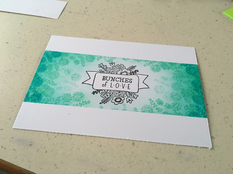
A change of mind occurred when I revealed this one, I was intending to colour the flowers with matching pens however I quite liked how this looked as it was so I decided to leave it.
Using the lighter colours I also created a couple of torn strip practice pieces.
Nice, but not quite what I was thinking for this project.
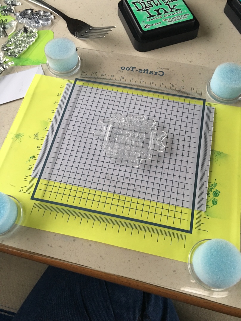
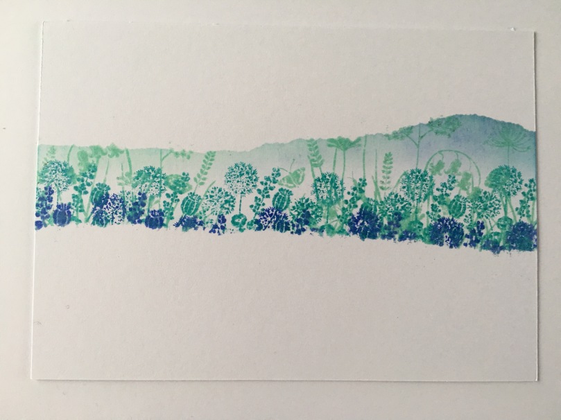
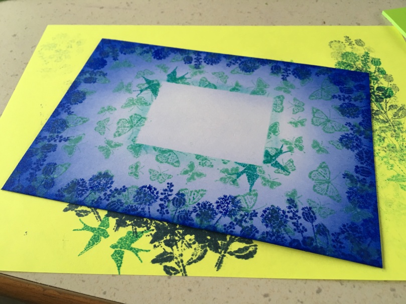
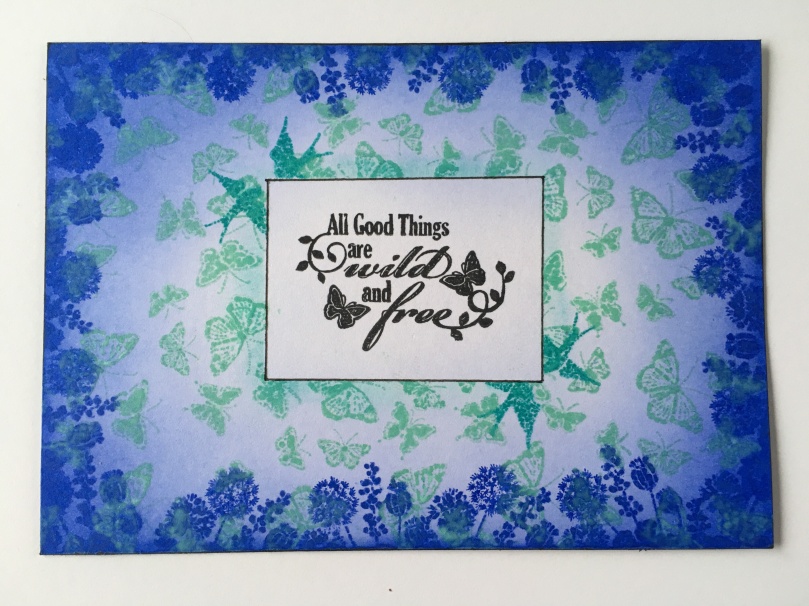
Instead, for the next creation I decided to utilise the intensity of the Blueprint Sketch more and so set about masking off the area in the middle where the sentiment would go and then went to town with blending and stamping.
Once the sentiment had been put in place I also added a line around it just to frame it a little better.
I also went on to create a second version of this style but using the intense blue in the centre instead of the edge.

Happy with both of those.
Ok, so there we have it. Some simple ideas for using some varied colour ranges.
What do you think? Did they work?
I’ll pop my June colour challenge makes into the June gallery at the end of the month. Wow, I’ve actually made the deadline on this one!!
Hope you enjoyed these makes and will be inspired to join in on the colour challenge series.
Many thanks for stopping by and I’ll catch you again soon.
J :)

Thanks for sharing John, some cracking ideas here!
Hope all is well, best wishes to both you and Maisie,
T x
LikeLike
Both gorgeous as ever John, you are multi talented, both artistic and with the scan and cut .Good luck with the rest of your trip.
LikeLike
Dear John,
Quick question, what do you do with all your creations, I often do not create the things I want to because I do not have anyone to give them to, who would like them that is. So I wondered what you do, as I need encouragement to create.
Cheers
Linda
LikeLike
They used to go in a box and stay there for years, nowadays I am limited in space due to being in a motorhome so often end up in the bin. I have in mind though that I should sell some and give the money to charity.
LikeLike
[…] via Colour Challenge Catch Up — Gentleman Crafter […]
LikeLike
LOvely designs using a restricted palette all very very successful! must try the June colours
LikeLike
I love this sentiment (you’ve used here). It kind of sums up what I try to encourage others to do. Make someone else smile and you’ll make yourself smile too.
Fabulous John. Great work.
LikeLike
Really like these John and love your choice of colours. Will have to remember these. Thank you for sharing.
LikeLike