Hello again. How are you? Good I hope.
For this post I thought that I would keep it simple and have a go at a technique that I have seen others do but, weirdly given it’s simplicity, have never done myself.
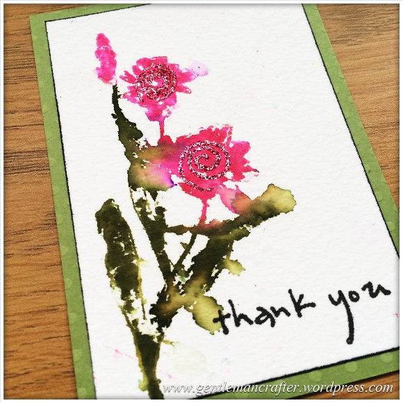
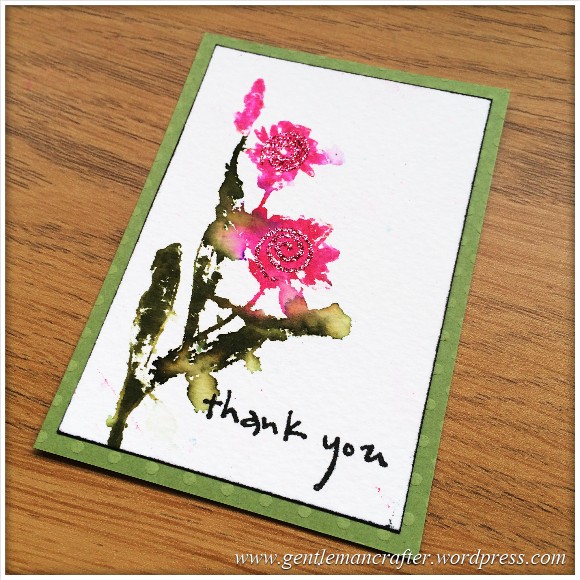
This is what I came up with.
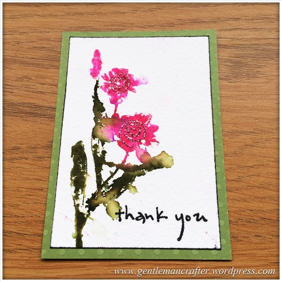
A very simple affair as I mentioned.
This artist trading card started with some watercolour card stock onto which I stamped the ‘Thank You’ sentiment.
I then grabbed the “Illumination” set of stamps from Penny Black (which has some lovely floral designs on it) and applied colour to the stamp with my Zig Art and Graphic Twin Pens. This was then stamped directly onto the card stock and a single spritz of water mist was applied which spread the colours a little.

To finished I edged the watercolour card with black ink (to give it a hint of a border) and then mounted it onto some embossed cardstock.
I did also apply a glitter swirl to each flower however if I did this over, I would leave that bit out – a classic case of less is definitely more.
But anyway, a pretty little design none-the-less.
What do you think? Would you agree that the glitter was not needed? How would you do it differently?
As always, if you have any comments or questions about this post then please feel free to use the comments section below. Also, If you know of anyone that would appreciate reading this post, there are handy sharing icons below.
Many thanks for taking the time to read about my little mini make.
I’ll see you again soon!
J :)

Quick question John – did you spritz the paper after applying the ink or spritz the ink on the stamp? Sorry to be so thick, but I really like this effect and want to have a go!!! Thanks, Susan
LikeLike
For this one it was after. But why not try both and see which you like best? :)
LikeLike
Simply beautiful. I also like the glitter as it does give a bit of extra ‘something’ but if you do something similar again it may look good with the tiny beads for the flower centres as stamens. Thanks again for the detailed instructions. X
LikeLike
Hi John
I have to disagree with you, I think the glitter swirl gives the flower extra definition. Perhaps instead use a colour pencil in a darked tone and add shading to define some petals? Obviously I’m seeing it on a screen not in real life so the lighting of the colours makes a major difference. I was looking at some watercolour pens to do similar, as I believe you can overstamp starting with very wet letting it dry them stamping over again. Oh dear, thinking in type again… but that’s a complement to you for making me think in the first place.
Have you thought about how you will display/ store all your ATCs? There’s a lot of fun options there I’d imagine making something stunning for them.
Hugs,
T x
LikeLike
Not a clue what to do with them yet. Think it might frame some faves though.
LikeLike
I totally agree with the others,love the glitter swirls…you have to have a little glitter on,….it’s the rules,lol
LikeLiked by 1 person
I really like this one John. It is very free & the colours are beautiful. Definitely my style
outstanding.
LikeLiked by 1 person
Thank you Adrienne :)
LikeLike
actually I like the glitter swirl, it gives the image a bit more depth and construct. Again, I love your choice of colour.
LikeLike
John, I am very much a glitter person so do like the hint of the glitter, I like this, simple and effective.
LikeLike