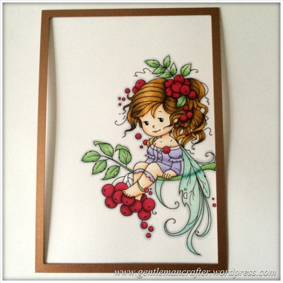
This week I have been having a little colouring in session with my Spectrum Noir pens.
I didn’t start this project with anyone in mind so I chose a fairy for the design as it’s one of those universal images that seems to sit well with most people – everybody loves a fairy, right?
Yes, yes, I know, I need to buy more craft stuff like I need a chocolate teapot (although that might be quite nice to eat), but believe it or not I didn’t have a fairy digi stamp.
I now have three. Lol!
I visited a few digi stamp websites and eventually found an image (or three) that I liked over at Wee Stamp Designs.
Having bought and downloaded them I printed one of them onto Neenah cardstock and got my coffee and sat down.
Here is the colouring sequence that I went through.
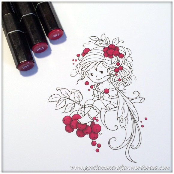
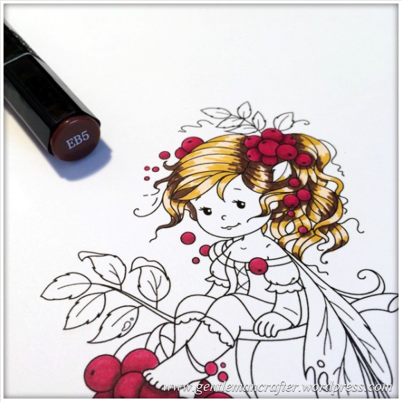
For the Berries
Pens used – DR4, DR6, DR7.
I first coloured the berries with a solid layer of DR4. Then added general shadows with DR6 and some detailed shadows with DR7. Finally I blended together with another layer of DR4.
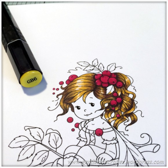
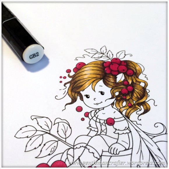
For the Hair
Pens used – GB2, GB6, EB5, EB8, GB10,
This ones going to be easier to follow the pics, but as an overview –
I made an all over layer of GB2.
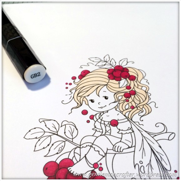
Then flicked in some GB6.
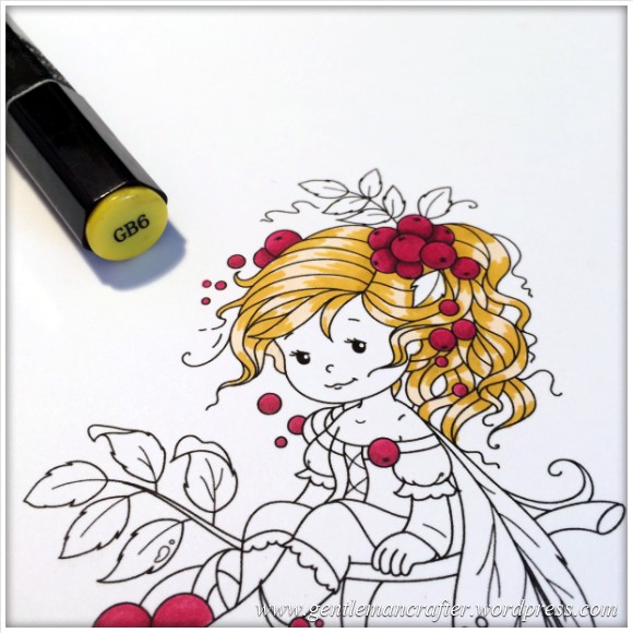
And some EB5 to create the deeper darker areas of the hairline and shadows of berries.
I then used GB10 and EB8 to soften the harsh colour contrasts of the earlier step.
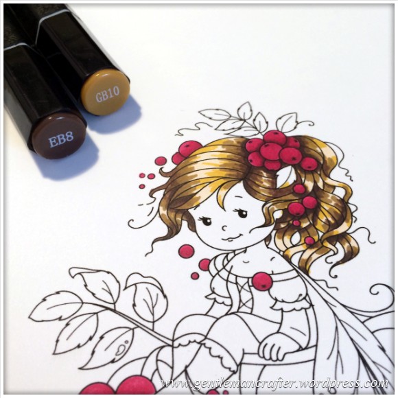
Went over most of these layers with the GB6.
And then aimed to blend it all with the GB2.
Not sure it blended it as well as I had hoped but I think that it worked out well.
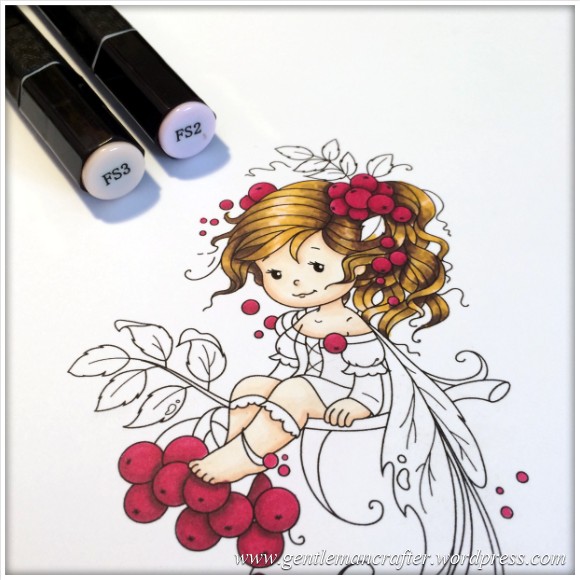
For the Skin
Pens used – TN1, FS2, FS3
As before I added a layer of the lightest colour, TN1.
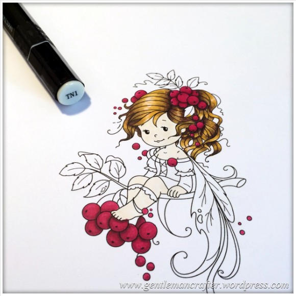
Then used FS2 and FS3 to added a slightly darker outline to the face and shadows on the hands and legs.
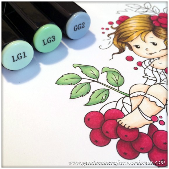
For the Foliage
Pens used – LG1, LG3, LG4, LG5, GG2
Starting with LG1 I added the base colour.
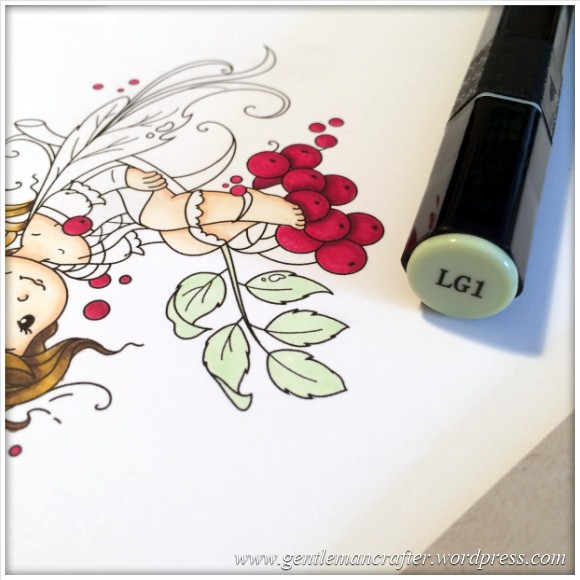
Then used LG3 to add some basic shadows.
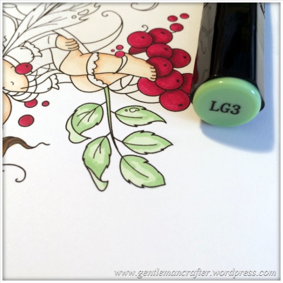
Then I successively darkened the shadows with LG4 and LG5.
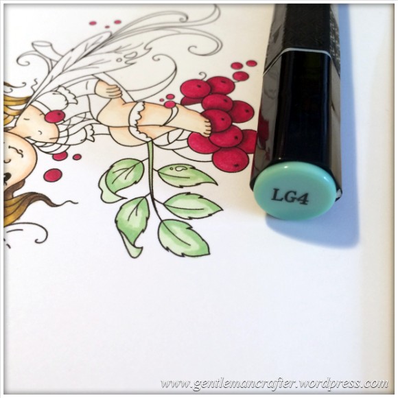
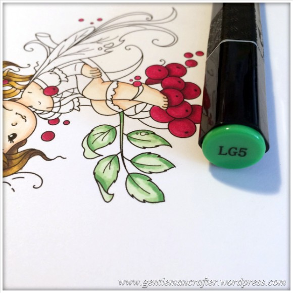
I then blended these shadow areas back in with LG3 and LG1. I also then went back in and added some subtler shadow effects with GG2.
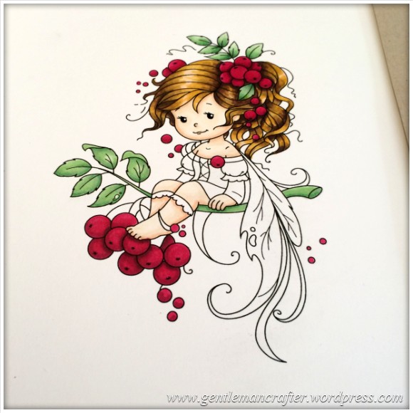
Hope you are following so far.
Here’s a quite overall shot to show how things were falling into place.
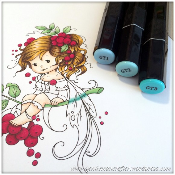
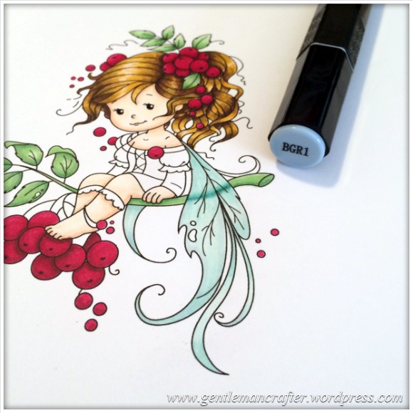
For the Wings
Pens used – BT1, BT2, BT3, BGR1 & GT1, GT2, GT3 (these three were for the translucent twig effect).
Just a quick explanation here. I wanted to give the wings a translucent feel so in order to do that I needed to added a little detail on where the branch went behind the wing. To do this I used the GT1, 2 & 3 pens to draw simple lines and gently blend.
I then went on to colour the winds with the BT1, 2 & 3 – forming a sort of highlight in the middle.
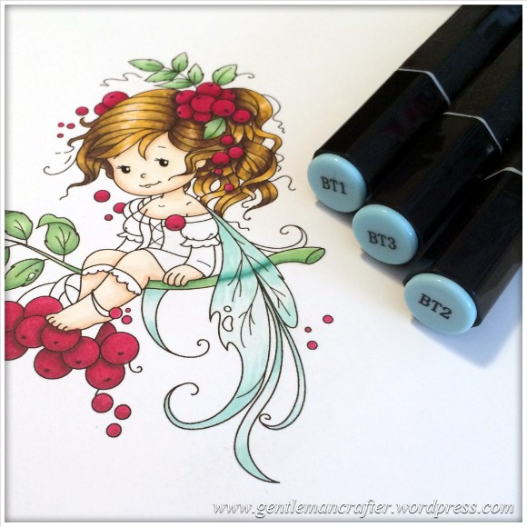
And then outlined the wing with the BGR1. It was a very subtle effect so not sure you’ll be able to pick it up in the picture.
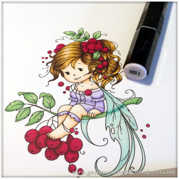
For the Dress
Pens used – HB1, HB2, HB3
I coloured all over with HB1.
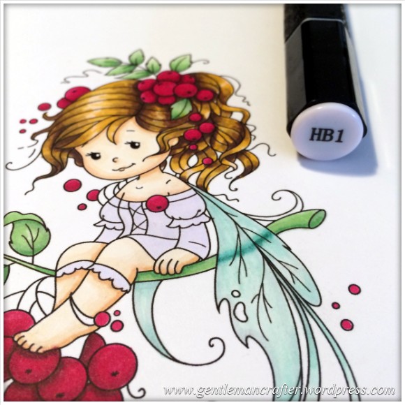
Added a general shadow with HB2.
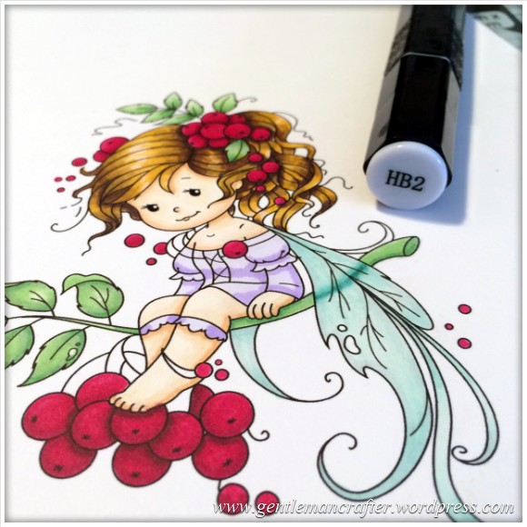
Added detail shadow with HB3.
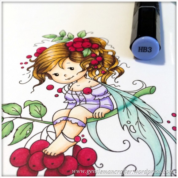
Then, blended with another layer of HB1.
To finish the colouring
Pens used – IG1, IG2 & Blender Pen
I oultined the design first in IG1, then the blender and then IG2. I felt that it gave it a nice subtle outline.
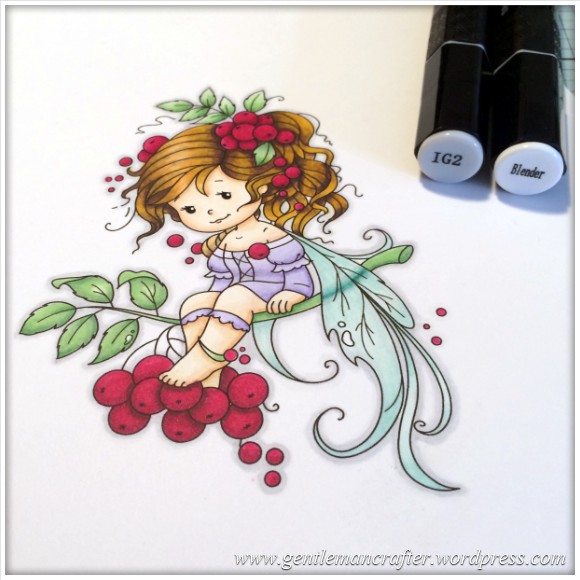
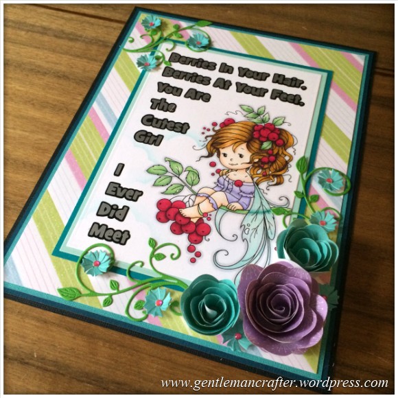
So that was the colouring done. Now I went on to work this into a card front.
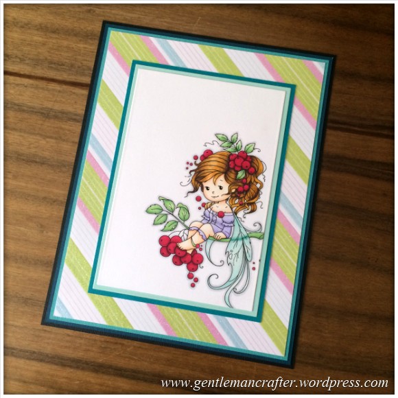
To begin with I dug out my Spellbinders Rectangular Matting Basics set of dies and worked out the position of the image on the front of the card.
At this point I also realised that I hadn’t got a clue what the sentiment was going to be so I put a call out to my friends on Facebook and Twitter – but more on that later.
I worked with a variety of cardstock (that I tried to match to the colours of the card), the dies and also the Perfect Layers tools (as the larger layers were bigger than my biggest dies) and ended up with this.
So, back to that sentiment. I asked if anyone had any ideas for sayings or sentiments that I could use and got some crackers back, here were some of my favourites.
- Tina Maree – As I sit here day-dreaming with berrie’s in my hair… I’m sending squishy hugs til I am there.
- Beverley Rollings – Have a berry wonderful day.
- Ginni Hodge – Remember, life is a challenge, but with you as my friend, my life is enriched.
- Melissa Kattman – Cherrish the Love … We’re watching from above.
- Barbara Tredwell – life is a joy when you live in the trees to sit on a branch and be gently rocked by the breeze.
But all of the ideas were very much appreciated.
I finally settled on one suggested by Tracy Anne Aquilla Smith. Tracy wrote “Cherrys in my hair cherry’s at my feet I am the cutest little girl you will ever meet”.
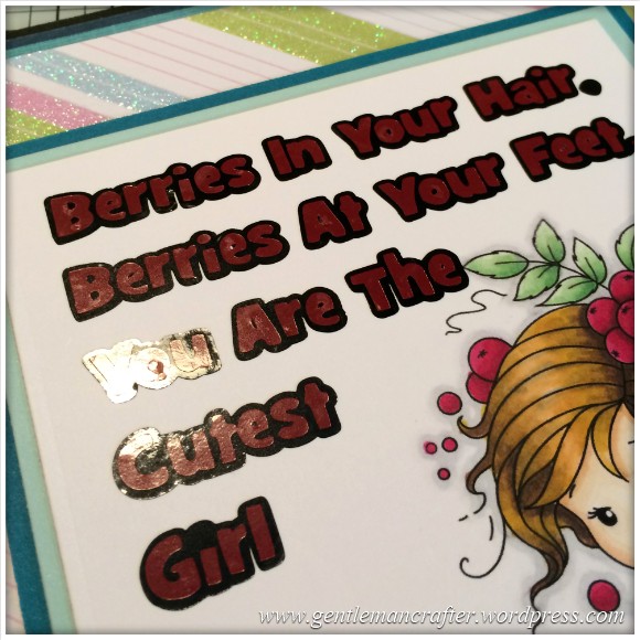
Now, given that these were Rowan berries and not cherries, I thought that I would mix up the sentiment a little and went with, “Berries in your hair, Berries at your feet, you are the cutest girl I ever did meet”.
I also wanted to use my peel off titling technique that I highlighted a few weeks back but also wanted an outline so I designed that on the computer and then cut the outline layer from black peel off sheet with my Scan N Cut and transfered it onto the design.
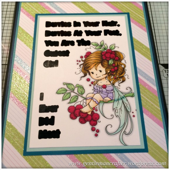
I then applied the top layer of text, which had also been cut at the same time from dark red peel off sheet.
I actually really didn’t like this colour combo, it was too dark for the overall look.
So I carefully removed all of the red letters and re-cut the design in silver and applied over the shadow layer.
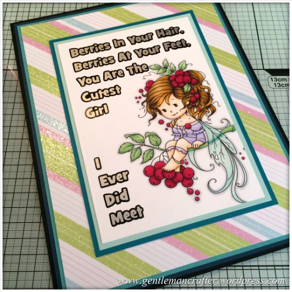
Yep, that was better :) I would have preferred a light pink (like that in the background paper) but didn’t have that colour available in peel off sheet, but this worked for me so I moved on.
Next I applied a tiny bit of cloud effect to the bottom left corner using a die cut of a cloud as a mask and some Pool coloured Adirondack Brights ink applied with a foam blender.
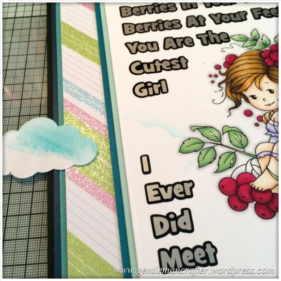
The next thing that I changed (this was becoming a “thing” with this card) was the text. I didn’t really like the placement of the word “the” above the fairies head and the space between the two parts of text so I carefully peeled off the words (with their shadow layers) and reapplied them.
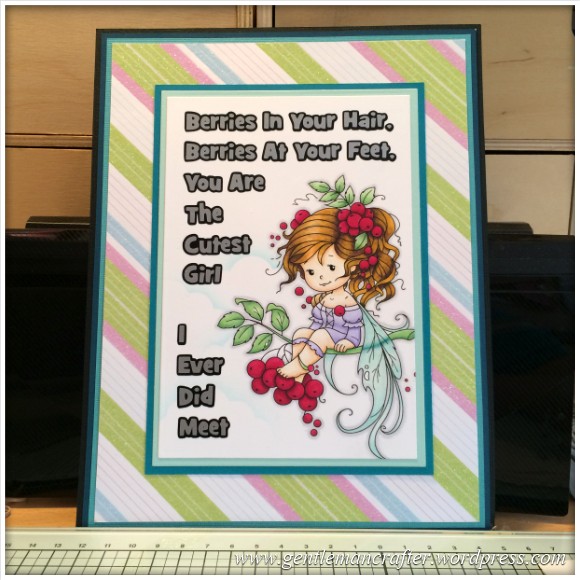
Ok, yes, I felt that it flowed better. Would you have changed it too?
To finish I reached for some floral dies from Spellbinders, Joy! and Cheery Lynn Designs and worked them all together with some swirls from Cheery Lynn Designs, oh, and some gems, obviously! :)
And here was the finished piece.
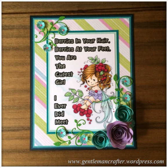
It’s cute, it’s fresh (only one layer of black!), BUT I think that I still need to titivate the bottom set of words a little and bring them over and up however I think that you’ll agree that everybody loves a fairy.
As a little surprise, I think that I’ll be getting in touch with Tracy in order to send her this card front (once I’ve adjusted those words) in gratitude for her contribution. But shhh, don’t tell here – it’s our little secret ;)
Well, that’s it for this week’s Monday Mash Up. I hope that you have enjoyed it. It was certainly a pleasure to create.
As usual, if you have any questions of comments about this post, please feel free to pop them in the comments section below.
Thank you for reading.
Look forward to seeing you next time.
J :)

well!! what patience you have and so good at explaining the processes you went through, love the outcome x
LikeLike