
Until now I have only really been using the Tim Holtz Distress Inkpads to add a shade of colour to a large area, or to accent the edges of a design so I decided to sit down and see if I could make it more of a feature for a design.
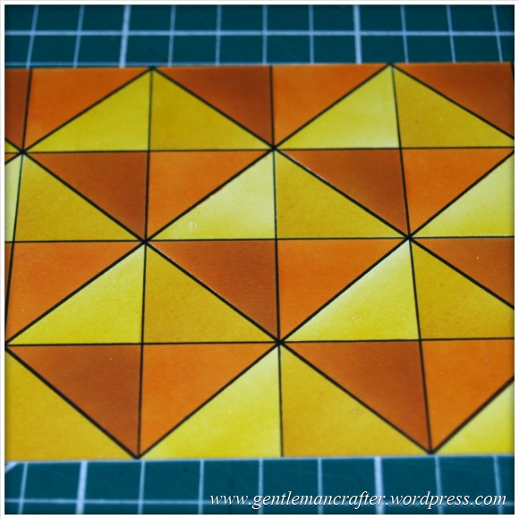
As I was looking for a bit of inspiration I stumbled across this piece of paper in my stash.
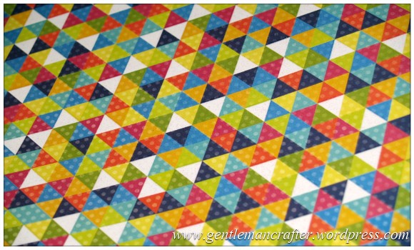 Nice isn’t it? (It’s from Die Cuts With A View in case you are interested).
Anyway, what I loved about it was the geometric styling and I wondered if I could create something similar.
I therefore set to work.
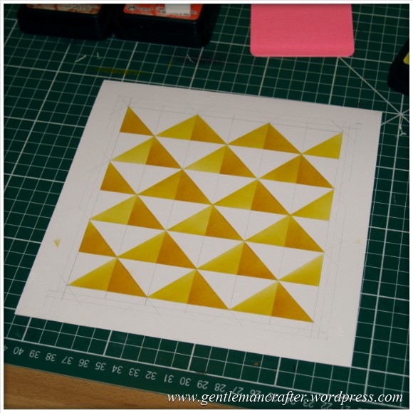
Grabbing a pencil, ruler and eight inch square card I started dissecting the card with diagonal lines and then horizontal and vertical until I had a pattern that I was happy with.
I did some colour tests to see which of the Tim Holtz Distress Inkpads that I would use on the final design.
The colours that I settled on are shown here.
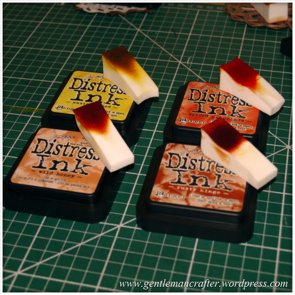 They were Mustard Seed, Wild Honey, Spiced Marmalade and Rusty Hinge.
I hadn’t used these colours much until now so was interested to see that I was happy with the colour combinations.
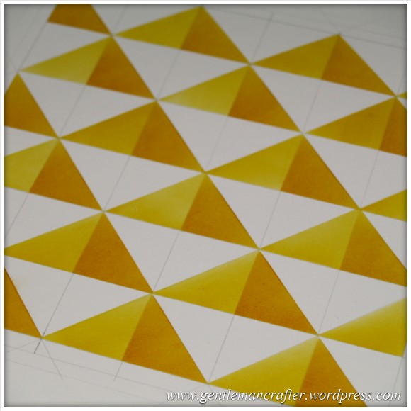
Anyway, I began masking off sections and then inking.
I used the colours in pairs with the lighter to colour the whole section and then the darker to add a shaded tone to one side of the triangle.
Here is the design after I had done the first row.
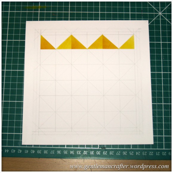 You can see the penciled pattern there also.
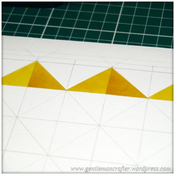
Here is a closer look at the design as it was then.
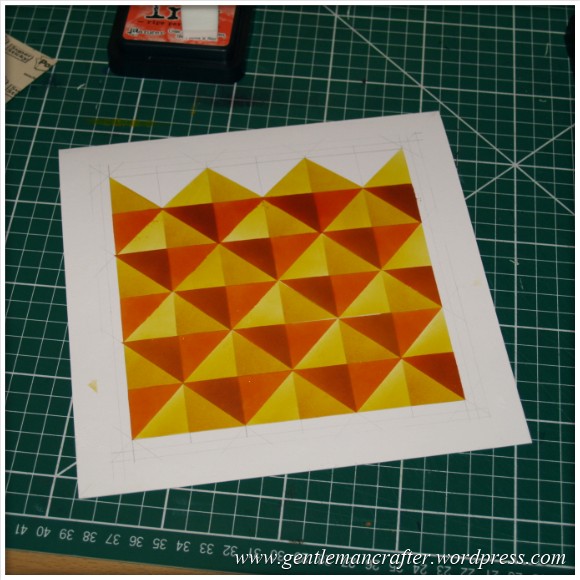
 I repeated the process for each row – masking and then inking – until I got to the end of the page.
It now looked like this.
 After completing the first set of rows, I returned to the top and began the second set with the other two colours.
As I took of the masks on the penultimate row, it looked like this.
 But at this point disaster struck!
One of the post it note masks that I had used had become too saturated with ink and bled through.
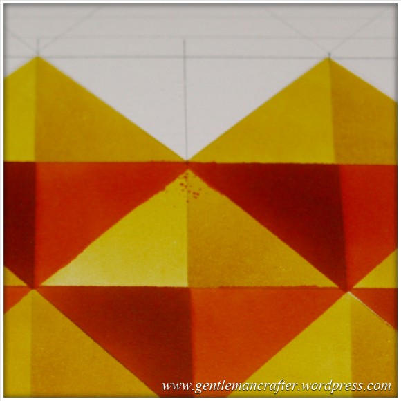
Nooooooooo!
After breathing into a brown paper bag for a few minutes I realised that I could still use the lower portion of the design, so instead of being a square card it would be a rectangle.
No big deal.
I chopped down the design and also traced over the pencil lines with a Pigma Micron pen.
Nice!
Right, I had already selected my sentiment earlier, from a sheet by Creative Expressions, so stamped this out, inked it with the same colours and then layered it onto black cardstock.
Now, was this going to be landscape or portrait?
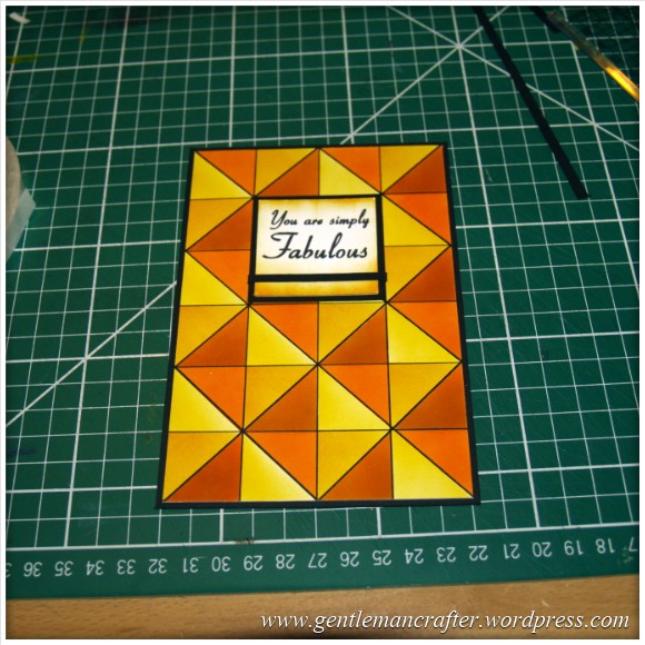
 I guess that it could have worked either way, but I chose landscape.
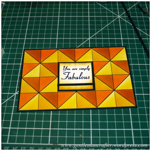
(You’ll probably have noticed that I had also taken the preparatory step of wrapping a thin paper strip around the sentiment. This was because I was going to add a bow later and a similar strip to the card).
Anyway, I layered the background design onto a white card (and trimmed to size).
Stuck the sentiment on using foam layering tape.
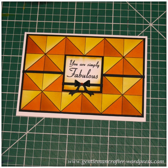
Then I finished it of with a die cut bow and a little gem.
Et voila!
 And again, but standing up.
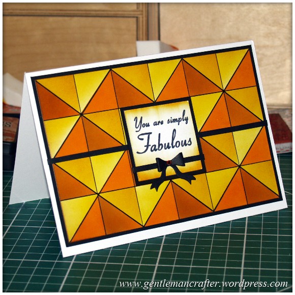 I think that, despite the almost disaster, it turned out right again.
What do you think? Is this something that you have tried?
Perhaps next time I will also try and use a mask or a stamp or two to add a little more excitement to the background…
As ever, if you have any questions, comments or thoughts about this post please feel free to use the comments section at the bottom of this page.
Many thanks for reading.
See you again soon.
J :)

wow!!!! Amazing!!!!! Thank you so much for sharing!!!
Abrazos from México CIty…
Maggie Alvarez
LikeLike
This is AWESOME!!
LikeLike
Simply fabulous! How to video please.
LikeLike
What a brilliant idea, not sure I have the patience, but will give it a go after all my Christmas cards are made!!! Can’t wait to see the next one with quilting in mind x
LikeLike
You have so much patience John – and obviously a lot of spare time too!!! but the end result is wonderful so thank you for sharing it with us. best wishes Jackie
LikeLike
Beautiful as always John. I look forward to seeing the next post from the gentleman crafter. Gail Rist
LikeLike
Hi John I just have to say no matter what you post to share with all us crafters I always find your work inspiring. I am very lucky to have a son living in America who has just come home with another 6 sets of Inkadinkado stamps for me. Have you seen the Ali Reeve masks/stencils she used on C&C recently. They would work well with todays design. Many thanks for all your hard work. Vanessa
LikeLike
That is one rather cool card, young John. I’m thinking I need my new glasses looked at though as when I saw the picture of all the inks you used, I could have sworn that one of them said Rusty Binge on the lid instead of Rusty Hinge :)
LikeLike
Fabulous! I, too, am a quilter. I was amazed at how dimensional it looks. I’ll have to try it!
LikeLike
Wow you certainly have some patience, it looks great. I have pinned it to my card ideas board to try on a rainy day when I have plenty of time.
LikeLike
Depending on your speed, you should only need a couple of hours of rain – not hard to find at the moment, eh? Lol
J :)
LikeLike
Certainly isnt here John!
LikeLike
Wow John, this appeals to me, big time, as I am also a quilter!
LikeLike
Quilting did cross my mind when I had finished this and I was tempted to draw some faux stitching on it but chose to keep it ‘clean’ instead.
Currently working on a card with a quilting theme though. Should be on the blog next week.
J :)
LikeLike
This card is fabulous! Who would have thought about a complete card just using the inks (apart from you)! Love it. Thanks for sharing your ideas.
LikeLike
Thank you for the compliment!
J :)
LikeLike
this is really effective and looks almost 3d. Somehow knowing that things can go wrong for professionals too hopefully will make me less annoyed when it does for me.
LikeLike
Whatever can go wrong, will. That’s what I’ve learnt from live TV.
The trick is to never let it stop you from starting, or indeed finishing.
J :)
LikeLike
Really eye catching John, sounded a lot of work though. The result is amazing love these colours, ” Zing” I think is the description!
LikeLike
Lol, Zing works for me, and yes, it did take a while. Time well spent though I think.
J :)
LikeLike
WOW. I don’t do much stamping yet. It is my resolution for next year. I want to use all my decoupage and then take up stamping in a big way for my childrens charity. This looks great and I am keeping the idea for then. Thanks for the inspiration.
LikeLike
Sounds like an exciting year ahead!
There are many stampers with blogs, including this one, so I don’t think you’ll be short on inspiration.
J :)
LikeLike
That is fabulous. I love the colours that you used and the depth of colour that you achieved. It’s a very interesting pattern and my eye is drawn to the different geometric shapes and shading.I also love how you finished it off with the little bow.
Try it again and put the lights opposite each other and the darks opposite each other. It may look like bows across the card. Just an idea. Its Fabulous :-)
LikeLike
That’s a great idea! I’ll certainly give that a go soon.
J :)
LikeLike